dps

Diploma in Professional Studies

Author: Daisy Rodway

  • Character Design with Isobel Stenhouse


    Introduction

    outfit iterations of a character I designed on this brief

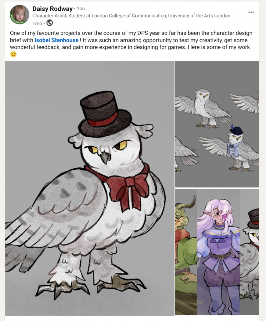
    One of the most invaluable live briefs I completed during my DPS year was a concept art project under the guidance of Isobel Stenhouse. Isobel Stenhouse is a character and environment artist who has worked on video games such as Little Nightmares 3, and across a variety of creative practices. Over the course of 9 weeks, she would be helping us follow a character or environment design brief whilst giving helpful critiques on the way.

    In this blog entry, I’ll be going through my entire experience and process, sharing the critique I received, and how I reached my final outcome!


    First meeting – The Brief

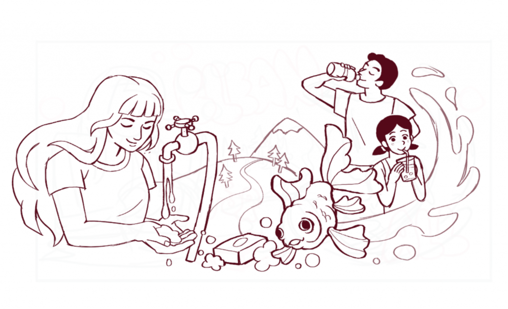
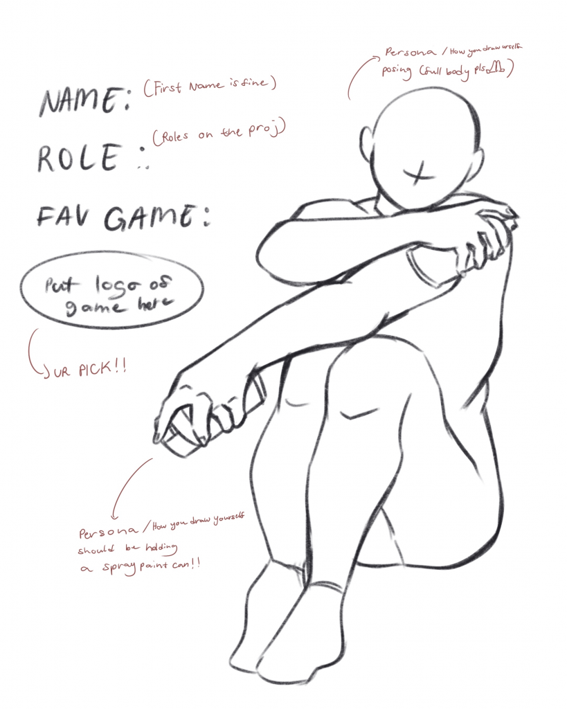
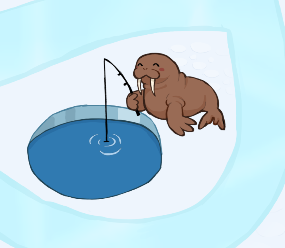
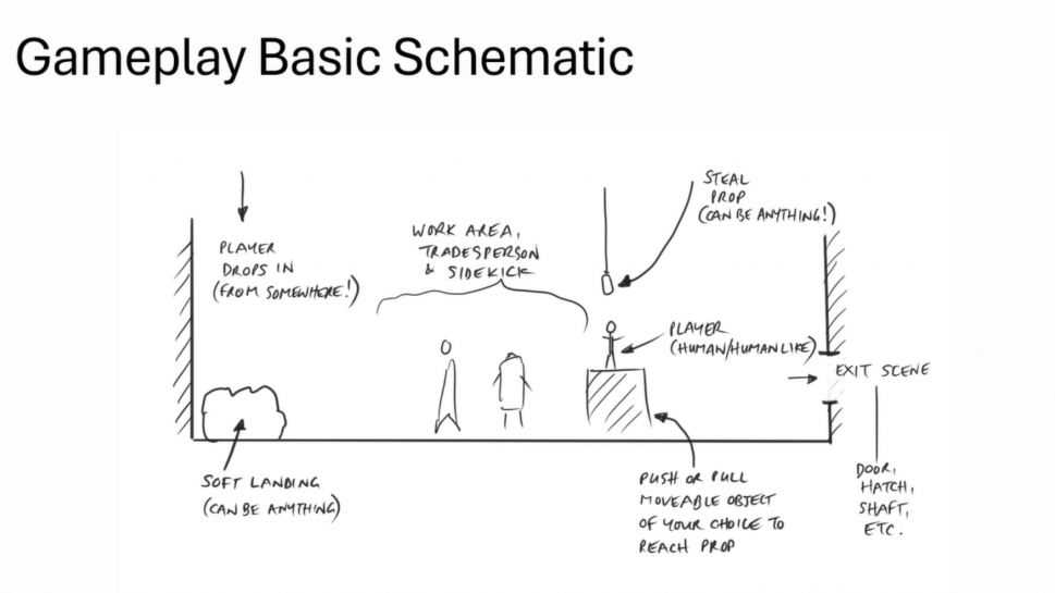
    After Introducing ourselves and learning about Isobel’s career in industry, we were talked through our brief. For this brief, we were asked to imagine a video game level (based on the image below) where a player character must sneak around, trying to avoid the view of the non player characters (NPCs) who work there, as to steal a prop that’s high up in the air. Here is the brief in full:

    A human/humanlike player drops into a scene on the top left, cushioned when they land. They sneak past the area where a lead character is working alongside their sidekick. They can be similar or different.
    The player finds a moveable object to place under a prop which is suspended above them. They climb to reach and steal the prop. They exist to the right of the screen (if they don’t get caught!).

    We were told to adhere to this concept as closely as possible- to build up our skills when it comes to the future of following Industry briefs. For our final outcomes, there were two pathways: character or environment.

    Isobel’s level design

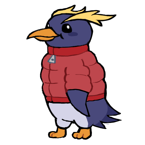
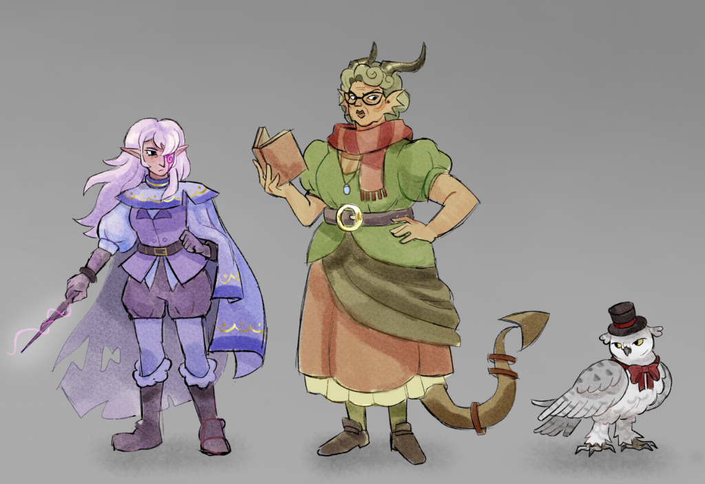
     Choosing the character route, my task was to create a trio of characters: a player, a shopkeeper/non player character (NPC), and that NPC’s sidekick. The player character is tasked with stealing something suspended up high from the shopkeeper. It was my job to figure out the details of these characters, the prop item, their setting and story.

    prop item final piece example
    ideas for how to present character final pieces

    We were also shown some examples of final outcomes, and how we could leave this project with a developed piece, polished enough to join our portfolios. I intend to make a Character lineup of all 3 characters, A turnaround, outfit iterations, dynamic poses- and a detailed prop.


    Concept and Proposal

    To begin conceptualising, I was asked to consider:

    • Game Genre
    • Location
    • Era
    • NPC with job role
    • Player
    • NPC sidekick
    • Item the player is stealing

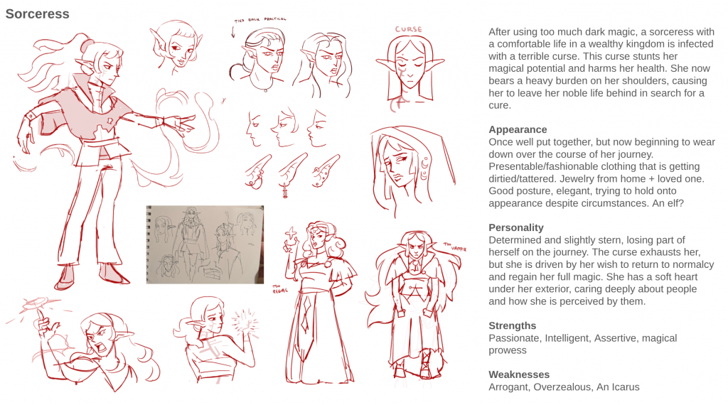
    Starting with the genre and era, I decided to opt for a medieval themed high fantasy setting. This is because fantasy games and worlds such as The Legend of Zelda and Dungeons & Dragons have always been a great inspiration to me and the characters I build. For the location I envisioned that the concept of a magical or haunted library would be fun to explore, as a magic setting allows for unusual characters with strange abilities, appearances and personalities to thrive.

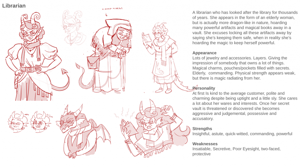
    I wanted my characters to stand out from one another in silhouette and size. My Player character would be relatively human, but I wished for my main NPC, a librarian, to be larger in size. When thinking about a lone librarian in a giant library, I began thinking of dragons and how they horde treasure. Perhaps my librarian could be like a dragon, but hiding magic books and knowledge away instead? Why would my player character want those hidden books, and who would be the sidekick helping the librarian out?

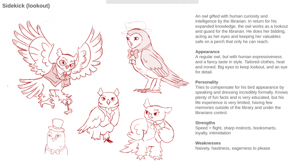
    My player character would be a sorceress trying to find the book to break a curse. My sidekick, I imagined as a creature brought to life/intelligence by the librarians magical knowledge- this way indebted to her and her bidding. Here is the short paragraph I made as my concept proposal:

    A sorceress is on the hunt for the cure to a magical curse. 
    Determined on her quest, she finds herself in a fantastical library, owned by a dragon-like librarian atop a frosty mountain. The librarian appears unassuming, but is hiding the book with all the answers in a chest. A key to the librarian’s secret horde is dangling overhead, something only the librarians trusty owl sentry can reach. The sorceress must avoid the watchful eye of the owl, whilst sneaking under the librarians nose…

    Now that I was happy with my concept, I could start collecting references and making sketches.

    My initial mood board
    my first sketches, capturing size and stature

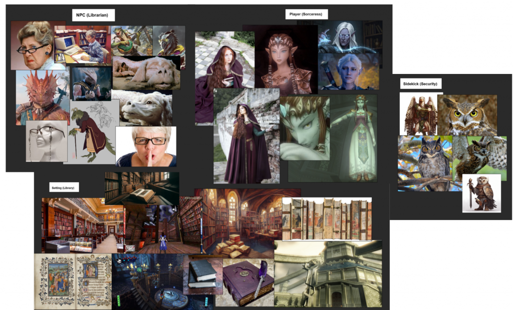
    In this mood board, I wanted to explore the presentation of each of my characters. For the Player (sorceress), I wished to create an elegant and regal appearance with jewellery and a tall stature. However, I also wanted to give the impression that they have fallen from grace in some way by being affected by the magical curse- possibly with messy hair, tattered clothing or an effect of the curse on their body.
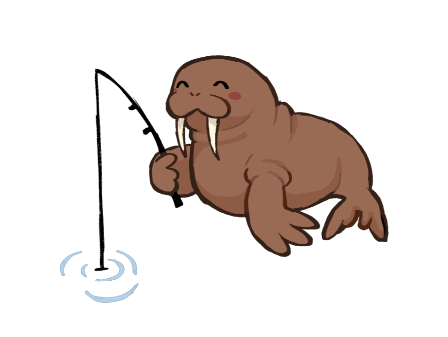
    For the Librarian, I wanted her to resemble a wise dragon. I aimed to give her clothing many layers, with lots of jewellery and accessories- as to show her tendency for hoarding and collecting. And for the sidekick, I settled on an owl- as owls are associated with wisdom and I would need a sidekick capable of reaching up high to hide the key our player is trying to steal.


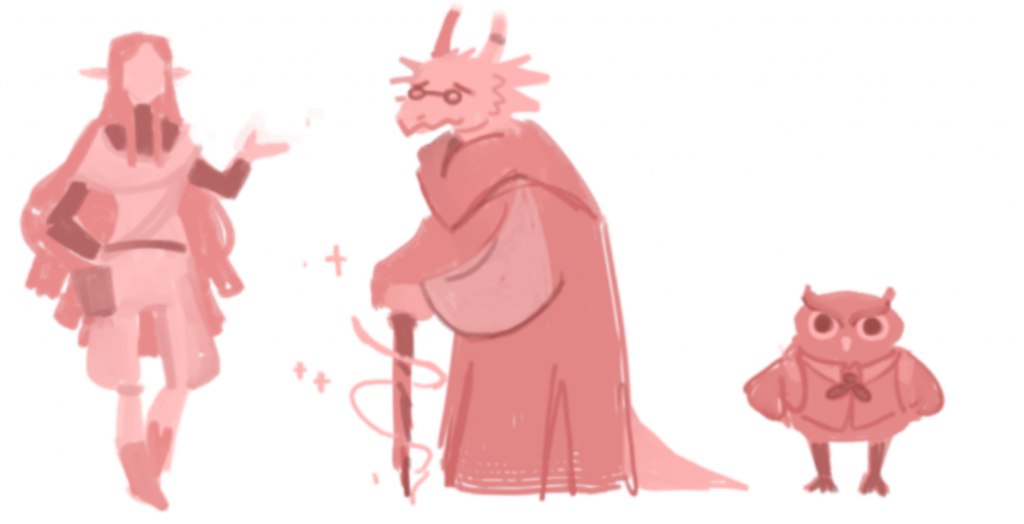
    Initial sketches and critique

    Sketches from my presentation

    It was now time to share my concept work with Isobel and the rest of my class in a teams call. Here, Isobel gave me lots of insightful critique. My characters appeared too polished visually for a conceptual stage, and didn’t properly portray the personalities and backstories that I wanted to create. Isobel emphasised the importance of iteration, and that experimentation in the conceptual process is key to understanding who your character is. I was tasked with inferring who these characters are on a deeper level, why exactly do they look and present this way, as opposed to what just looks cool or appealing on the surface. For example, if my dragon librarian was supposed to be an antagonist, greedy and secretive, where would such things be evidenced in the way she dresses and carries herself? I was asked to focus more on gesture and shape language, as well as to exaggerate the size differences in my characters as the player and librarian are almost the exact same height.


    Further design exploration

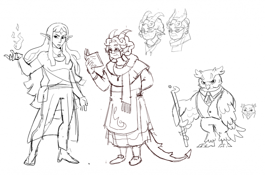
    In response to Isobels critique, I decided to work on the appearance and backstory of each character in detail. I designed a variety of iterations and through trial and error as well as peer critique, then began to see a clearer vision of each of my characters.

    Please look at my concept sketches and read the text in the slide images below:

    After presenting these new design ideas to Isobel and the rest of the class, I was able to start narrowing back down my designs with detail and colour.
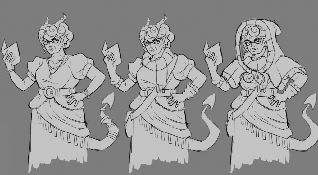

    Design Refinement

    sorceress fullbody design

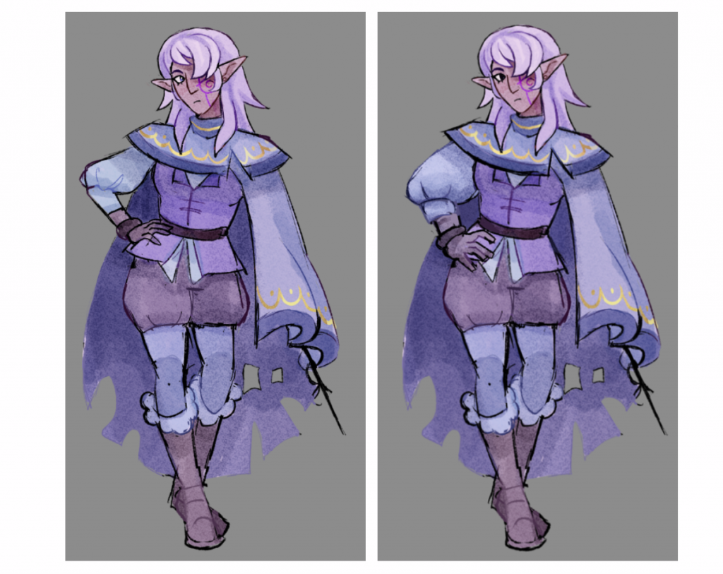
    When refining my designs, I wanted to make sure to make the entire body balanced. I had a few issues with anatomy along the way, and had a habit of drawing legs too short repeatedly! Thankfully, checking in with Isobel in our 1-to-1 sessions helped tremendously. Upon showing this piece (upper left) to Isobel, she noted that the arm resting on the hip was slightly out of proportion- much flatter than the rest of the anatomy. I was encouraged to redraw this area of the design, making sure to maintain volume in both the arm and poofy clothing surrounding it (upper right). This change made my illustration far stronger overall!

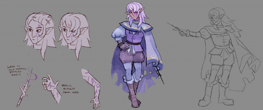
    I gave the sorceress a colour palette dominated by deep purples and blues. These colours evoke a sense of mystery, as well as having connotations with magic. They also resemble the rare dyed fabrics that people of high status would wear in the medieval times, this hint to her past wealthy lifestyle is further accentuated by the golden trims on her tattered cloak.

    On her face is an abstract symbol, a brand over her eye that is associated with the curse she’s now afflicted with. She uses her long hair to cover that side of her face, and the unevenness of her cloak is hiding the rest of the curse’s effect on that side of her body.

    librarian sketch

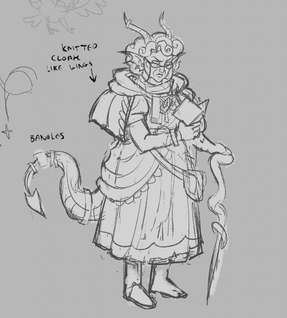
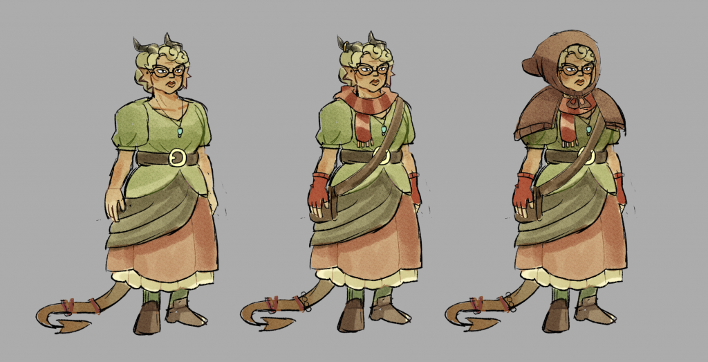
    These sketches explore the layers of the librarians outfit. I imagined her to wear too many layers, even indoors, to hide her dragon-like horns and display her habit of collecting. Not only does her knitted cloak hide her horns, it covers her upper arms in a way that could resemble dragon wings. Her clothing style doesn’t have one defined aesthetic, instead blending a mishmash of fabrics and materials to cover herself up. She enjoys shiny accessories, and wears not only earrings and necklaces but extra bangles on her horns and tail as well.

    librarian clothing layers
    Owl outfit iterations

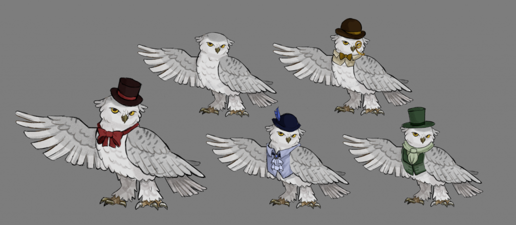
    When it came to the owl sidekick, I also wanted to explore the variety of his wardrobe. He is fascinated in humans and the act of being a gentleman, so I gave him a variety of tailored clothes to express this quirk. I also settled on taking inspiration from a snowy owl for his appearance, as I envisioned the library to be in the middle of nowhere, up high on a frosty mountain.
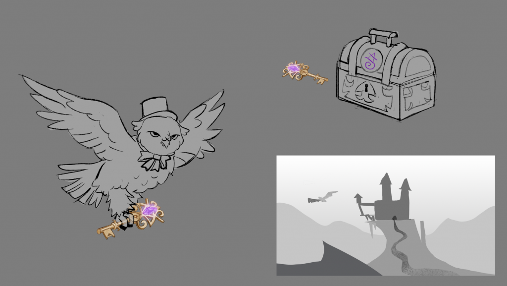

    Prop

    For my prop, I settled on a key. This is because a key could easily be guarded by the owl and kept high out of reach! This key is what opens a chest containing the book my sorceress needs to break her curse.

    key sketches

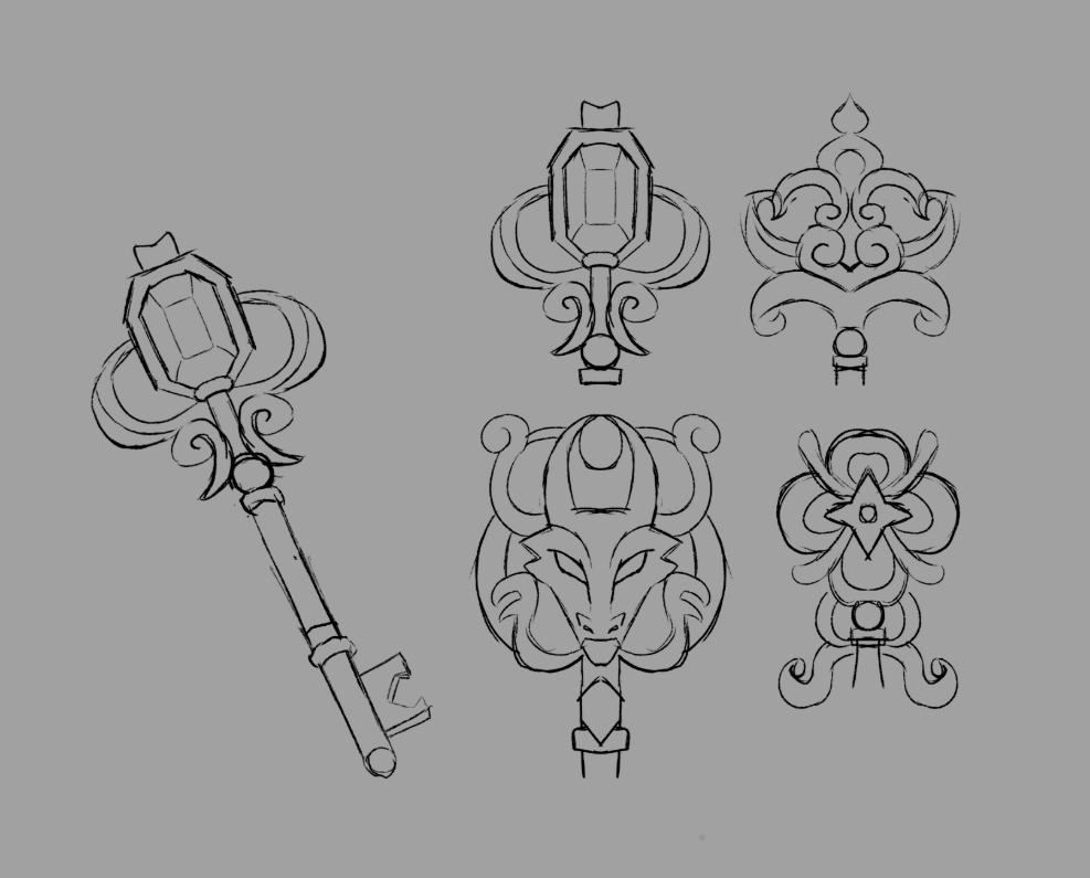
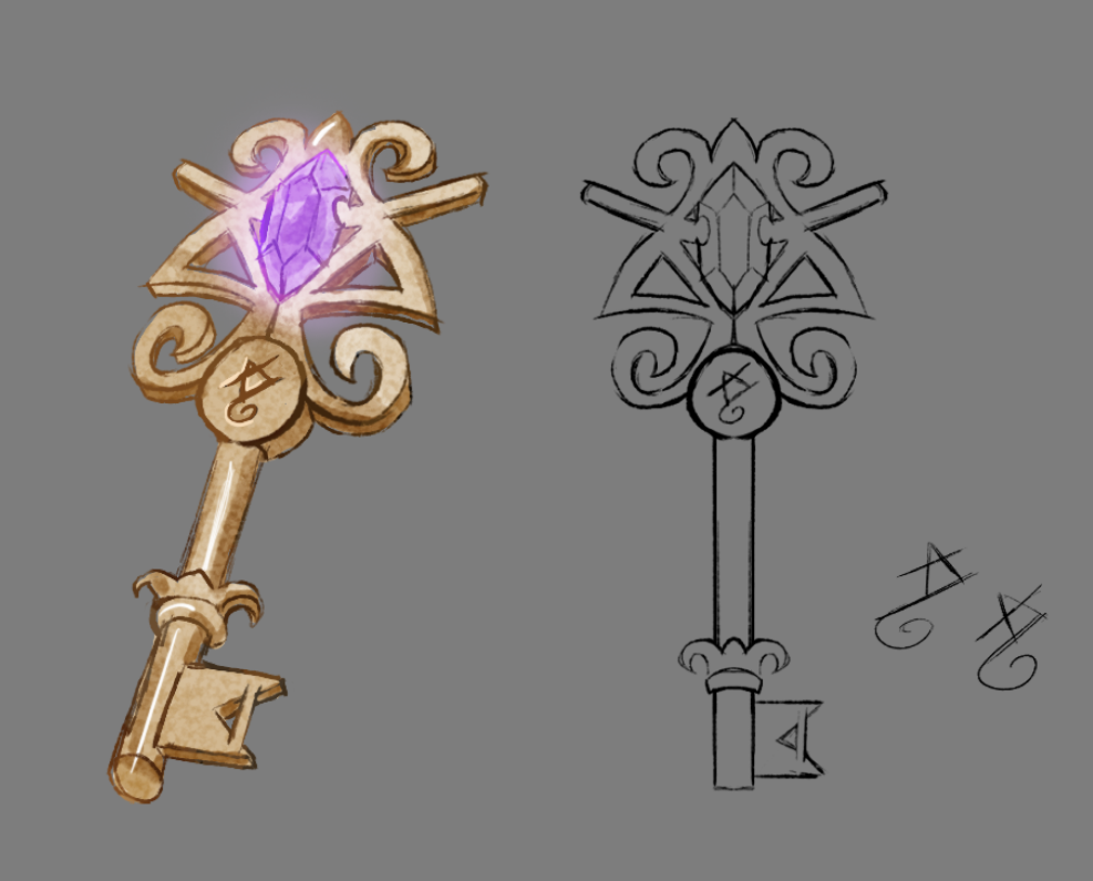
    I designed various iterations for the key, ornate and detailed. Originally, I wanted the key to look luxurious as it belonged to the librarian as part of her horde. Instead, I opted to make the key resemble the symbol on the sorceress’s face- linking it to the curse she’s afflicted with and making the prop more significant. It glows with the same purple as her mark.

    I also sketched out a small chest design, and drew the owl carrying the key as to convey its scale and various uses in the game level.

    key final design
    key development

    Outcomes

    For my final outcomes, I went into further design detail. I designed the sorceress’s curse marks in full, designing the half of her face that is hidden beneath the hair as well as her left arm. By lifting her hair up, I can show off all of her features. I designed the wand- which she uses to help channel her magic since the curse altered her power, and drew her in dynamic poses to show her body language.

    sorceress character sheet

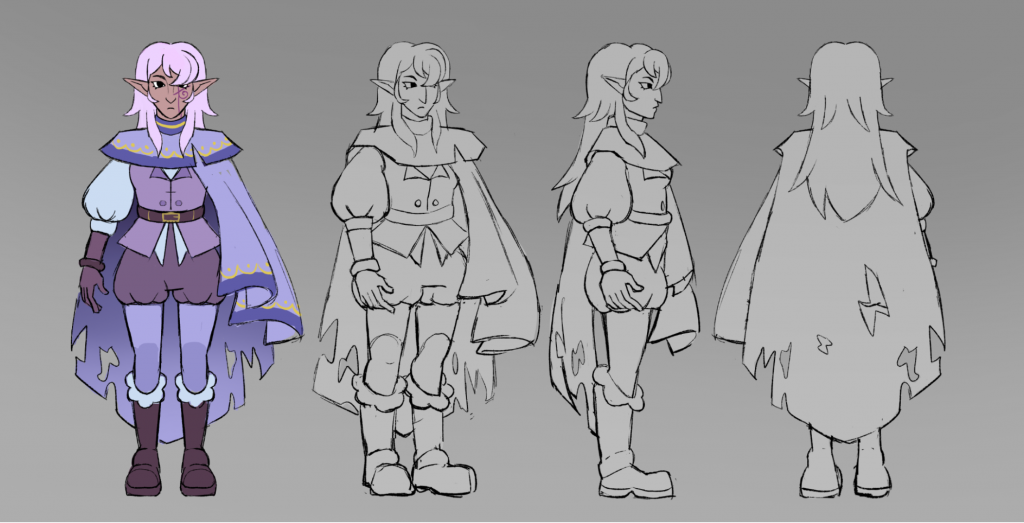
    I created a turnaround for the sorceress as well, displaying her clothing and form in different angles to give a 360 understanding of how her outfit works and how her design would appear in a 3D space.

    sorceress turnaround

    The Librarian was given a colour scheme that would stand out against the sorceress. I chose earthy greens to evoke the image of a dragon’s scales, and a pop of red and orange for draconian fire. Her warm colours contrast the cool colours of the sorceress, placing them as opposites/opponents in the narrative. As mentioned before, her layers of clothing and excess of accessories show off her tendency to horde, much like how she’s stashing away the magical book the sorceress needs for her cure.

    librarian clothing layers
    lineup


    Reflection

    I found this live brief incredibly rewarding, It tested my creativity and I was able to get critique and advice from an industry professional along the way. If i were to complete the brief again, I would probably make sure my final outcomes are more polished, as my final lineup looks quite rough in comparison to a lot of my work. This is because I was simultaneously doing my artwork at The Dangerous Kitchen, and didn’t have as much time as i would have liked to give these characters the finishing touches and refinement they deserve. However, overall I am very happy and believe I have made some compelling concepts!

    Once the brief was complete, I made sure to post my work on artstation and Linkedin, thanking Isobel for the wonderful experience!

    linkedin post

    Return to Home Page

  • Purr Purr Productions Mural


    Introduction

     For this live brief, I was given the task of creating a graffiti-esque mural to populate the streets of a video game. This game takes place in the setting of Brick Lane and features the 17 UN sustainability goals. In this blog entry I will be going through my process, from research to execution!


    Research

    Before putting pen to paper, I wanted to make sure to do thorough research on my sustainability goal and what it represents. I visited the United Nations sustainable development goals website and learnt all that I could gather before making moodboards and ideas for my presentation.

    Put simply, the goals main objectives are:

    • Drinking water safe and affordable for all 
    • Access to sanitation and hygiene 
    • Protect water-related ecosystems

    It is important that my mural presents each of these goals clearly. When looking through the iconography and graphic design present on the website, the colour associated with goal 6 is a bright cyan. When it comes to symbols and objects, taps, glasses of water, sinks, and soap. There are also mountains, rivers and trees present around text discussing water-based ecosystems. I decided that the best way to bring across a similar message would be by taking these design aspects and incorporating them into my own work and style.


    Mood Boards and Style Analysis

    To begin conceptualising how my mural would look, I began gathering various references. My mood board consists of atmosphere and colour palette references, relevant video game graffiti references, as well as info graphics based on clean water and hygiene.

    colour palette and atmosphere
    info graphics, subject and composition
    graffiti in Splatoon, Jet set radio, Bomb Rush Cyberfunk

    For my piece, I wanted to combine both the expressive and bold video game graffiti style with the more informational and straightforward info graphic style. It was a challenge to find a middle ground between visual excitement, and the messaging I wanted to convey. In the video game series Splatoon, the iconography and art style takes inspiration from many types of sea creatures, aquatic wildlife and water imagery- easy to apply to clean water and sanitation. I plan on adding a sea/water creature to my piece in a similar style.

    In the graffiti artwork, line work is bold and harsh with exaggerated sweeping shapes to mimic the movement of spray painting. Info graphic style however is simple and reserved, round to appear inoffensive, and often removes line art all together. To try and capture the essence of both styles, I aimed to create a piece that is round, visually appealing, with large bold shapes, but a colour palette that is gentler and softer to the viewer. Evoking calm water, health, cleanliness- but also the fun movement and excitement of graffiti artwork.


    Concept

    Once I had my inspirations, research, mood boards, and general idea, I was ready to make some initial concept sketches. I wanted at least one subject to portray each core objective of the sustainability goal. One for available clean drinking water, engaging with water from taps or bottled water and drinking it, one for hygiene, perhaps taking a bath or washing themselves, and one representing water-based ecosystems, wildlife, and the cycle of water in nature.

    The scene should stress the importance of water: how crucial it is to everyday life, health and hygiene. The figures in my illustration should look happy, calm and content. I want to evoke a peaceful atmosphere. In the background I wish to include the entire water-related ecosystem, such as mountains, forests or lakes with clouds overhead. For the colour, I want to use the aforementioned cyan: clean, crisp and calming.

    rough sketches
    style exploration

    I made some initial sketches of a goldfish and man drinking water, however when trying to add these sketches into an overall composition- they appeared far too stiff. If my mural wanted to look convincing and dynamic, I would have to redraw them to fit the flow of a scene. Upon redrawing them, I made sure to make their poses less 2D, using foreshortening to have the goldfish look as though it is swimming out towards the viewer as a splash of water trails behind. The head of the man is now also angled towards the viewer, as to show his expression clearer and make it easier to engage with. I also simplified my figures, keeping their features incredibly simple as both street style art and informational art tend to stylise faces for easy readability and appeal.

    final composition sketch

    Execution and Final Piece

    I presented my mural in 3 layers. A basic line art layer, a flat colour layer, and a final layer. This is because in the game, each layer is painted by the player character one after the other with spray paint as a slow reveal.

    For the colour, I really wanted to emphasise the cyan with a split complementary colour scheme, emphasising the blues without straining the eyes.

    To make sure that the mural is readable when painted against the walls in the game, I added a bubble / cloud shaped silhouette with a subtle gradient behind my illustrations to give the impression of a blue sky overhead.


    Promotional Artwork

    Outside of the mural, I took part in the promotional artwork that would be posted on social media to promote the game. Each artist was required to draw themselves holding a can of spray paint, calling back to the game’s main mechanic, as well as list their roles and interests. My self portrait doodle can be seen on the right 🙂


    Reflection


    Return to Home Page

  • Bigmode Game Jam – Signed, Seal-Delivered


    Introduction

    From January 29th, to February 7th I was a participant in the 2026 Bigmode game jam! As the sole artist in my team, Over the course of two weeks I was in charge of the art direction as well as the production of character art, animated sprites, background art, props/assets, and splash/cover/promotional art. This was a demanding challenge, but the end result is something I’m proud of.

    You can play our game, Signed, Seal-Delivered by clicking the link here:
    play!

    screenshot from Signed, Seal-Delivered

    Theme, Concept and Gameplay

    The theme of this year’s Bigmode game jam is ‘Slick’. This word is what we had to base our game idea and mechanics on. The conceptual phase had to take place on the first day- as every minute counted when it came to production! After conferring with my team, we decided to go through the different meanings and associations of the word ‘slick’ to come up with an appealing idea as fast as possible.

    • Slick as in cool or suave
    • Clever, efficient, deceptive
    • Slick as in slippery
    • oil, slime, glass, ice, smooth

    We decide to go with ice as our core representation of slick, and our game mechanic would be the act of sliding around on the ice and gaining momentum.

    One of our main inspirations for gameplay was the game ‘Crazy Taxi’, where players have to collect and drop off passengers to set locations as fast as possible. This made us think of a delivery service- perhaps our player could be delivering something whilst using the icy roads for speed, trying not to crash or fall through the ice. However, 3d was too large a scope for us to create in the timeframe, and so we settled for a 2D approach to this instead.

    screenshot from the game Crazy Taxi
    Map/Level concept for our game, designed by Ivy Hibbins

    In our game, you must pick up fish and other items across the map whilst using icy roads to guide your path. If you lose control on the ice though, you’ll fall in the water and lose time. The more items you deliver to the other animals across the antarctic before the timer runs out, the bigger your score. Here is the synopsis I wrote for our game page:

    Using the SLICK ice roads around town, help Seal and his friends stock up on fish. It’s your job to help the community, whether that be hauling tasty seafood from igloo to igloo, or saving oil-SLICKed birds from an accident at sea.

    The quicker you slide, the faster you deliver- the higher your score! But be careful,  slip into the water and you’ll lose your item in a splash! 


    Seal time!

    Niko the seal

    Now it was time to consider our player character. We decided that a character mascot would be most appealing and easy to animate, something cute to draw people into clicking our game and giving it a play. We thought of a penguin first, as they slide around in cold climates- but eventually settled on a seal. Seals slide around on their bellies, are very approachable and cute, as well as popular currently. Many people are fans of Niko the seal, a particularly famous seal with a unique face born at Japan’s Toba Aquarium- I will be taking inspiration from his charm for my own artwork! Now we had come to a conclusion, it was my job to start designing our seal protagonist.

    my first seal drawings

    I began drawing our seal delivery driver right away. The image above contains some of my first iterations. When getting feedback from my team, they said I should try to make their features even bigger and cuter- and so I went on to exaggerate the proportions further, giving my seal an incredibly bulbous chibi style head for maximum cuteness that can be read at a distance. We also wanted the seal to be wearing uniform, somewhat resembling a post officer, as the main objective of the game is making deliveries to other animals.

    final seal design

    Despite originally wanting Seal’s colours to be airbrushed, resembling the softness in colour of seal pelts in real life, I decided to opt for flat colours in clear shapes. This is because I would have to animate this seal in the game sprites, the clearer the design the easier it will be. Time is of the essence!


    Animations

    To start with, I needed to make sure I had sprites of the seal facing all 8 directions. It was Important to keep incredibly consistent, as I didnt want the forms to warp out of place or become unreadable at different angles. In my first draft (pictured below), there were many issues. The height and shape of the hat was different in almost every sprite- giving the impression of it wiggling strangely when the seal turned. As well as this, It took me the feedback of a team member to realise that the eye shine was flipping directions with each turn! Thankfully, after some revisions, I managed to create consistency. These 8 directions would be the foundation for all of my other animations, as soon I would have to animate both the walking and slide animations in 8 directions as well.

    My first rotation draft, the shapes were very inconsistent…

    For the walk animation, I watched videos of seals galumphing as reference. My aim was to capture the movement of a seal propelling itself forward using their flippers and bellies. I kept the animations as simple as possible to ensure enough time for the rest of the art production.

    walking ‘galumph’ sprite
    8 directions of galumph
    slideeeeeeee

    Map and Level Design

    My team wanted the map to be in the shape of a whimsical star and to look like the antarctic, the ground made of snow. We also wanted icy roads, and for the map to be surrounded by and filled with water as an obstacle for our seal player to avoid falling into. It was difficult drawing out an entire level like this, as it was something i’d never done before! Eventually in the testing phases, we found the star design a little impractical… but, it was too late to change now. With our time constraints, our only option was to keep moving forward and work with what we have.

    final map layout

    The map was finished, but without other assets- it looked incredibly bare. My next step was to populate the levels and create visual interest, as well as things for our seal to bump into and interact with.

    The most essential obstacles for me to create were trees and igloos, bringing life to the icy landscape and providing places for the seal to deliver to. I took lots of inspiration in the environment art from Club Penguin.

    club penguin igloo village
    tester image, I placed the trees and igloos onto the map draft with a seal sprite for reference.

    Other obstacles I designed included a snowman, and a hospital lodge. This lodge is intended to be the delivery destination of an oil-covered bird, who you find and help out after a blizzard caused an oil spill at sea.


    Props and NPCs

    Our seal has places to deliver to, but who are these deliveries for? and of what? I aimed to make at least 3 NPCs, and 3 deliverable props for variety between levels. To my surprise, I was able to make more than I expected. My NPCs included a stoat, a penguin in a puffer jacket, a fishing walrus- and Biggie the frog, the Bigmode game jam mascot.


    My main prop designs were incredibly simple, tiny objects that related to the NPCs that were requesting them, and that the seal could carry on their head. Other props were far more intense to create, like the oil-covered bird that you have to deliver to the hospital- and the flaming torch that I had to learn to animate.

    Unfortunately, only the main blue fish and bird were ever implemented into the game due to time constraints. It was a shame for these assets to go unused, but that is often the case in game jams and game development as a whole. Despite that, I had a great time making them. Animating a flame was a particularly large learning curve that i’m happy to have overcome.

    Bird after being healed at the doctor, bird covered in oil, and the oil spill that generates when the bird level is active
    unused flaming torch prop (was designed to melt an npc out of ice)

    Cover and Splash Art

    For people to actually play our itch.io game, it needed to have an appealing icon. In my thumbnails, I wanted to make sure every aspect of our gameplay loop was present and easy to read. The ice paths were a must, as well as iconography associated with deliveries and postmen.

    the final game icon / itch.io cover


    I showed my teammates these two compositions, and the main critique was that in the second thumbnail the seals eyes werent open, making it harder to connect with the character and design. I would later take on this feedback and incoroporate the open eyes into te icon. My team couldn’t decide between the two, and so I decided to reuse the first thumbnail’s composition and tweak it somewhat to be included in the title screen.

    title screen concept art

    As well as a title screen, I had to design splash art for every state where a player finishes the level. A lose state, where the player does not deliver enough fish results in a picture of our seal carrying too much fish to handle. A win state, where everything is delivered on time, results in an image where the seal is jumping for joy. Finally, a completion state for finishing all levels, where the seal can relax after a hard day of work.

    final title screen
    lose screen
    beat level screen
    finish all levels screen

    My work was still not over, as now the Itch.io page itself needed designing! I created an alternate composition of the start screen for the banner, and designed a custom watery background using the icebergs i’d drawn for the map. The final step was writing out a fun description fitting of our lovely seal.

    itch.io banner
    itch.io page

    Reflection

  • First Week!

    The beginning of October marks the start of my DPS year. Over the course of this month (and a bit) I’ve taken part in workshops, made new connections, visited galleries and studios, and started several projects!


    My first week back at university was filled with a variety of talks and workshops to get me started on my DPS year. I aimed to arrive on time every morning and take notes! The information shared over the next week was going to be invaluable, showing me where to achieve my 100 days working with industry outside of placements alone.

    Monday
    In my welcome session on Monday, Maliha gave us an overview. She introduced us to DPS and informed us about our assessment around may, suggesting we start our own MyBlogs! As well as this, we were given information on the Live Briefs that we would be undertaking in the future. These included Get Living, Isobel Stenhouse, ACTSA, Purr Purr Productions, Museum of Brands and Blink Industries.

    The remainder of my first day back consisted of a Lego workshop, where I worked alongside a team to create a variety of Lego builds- exploring teamwork and collaboration! It was a fun icebreaker that helped us get to know new people!

    Every morning onwards consisted of informational talks, each from a variety of organisations and inspirational people. These sessions discussed the rights we have as creatives, the power our creativity holds, and the importance of networking and community.

    Tuesday
    Tuesday revolved around IPs, Copyright and AI ethics. We were taught the risks of sharing our art and portfolios, and how to approach situations where our art is used against our will, or where our rights are put into question.
    Wednesday
    On Wednesday we had a Q&A session with ‘I Like Networking’, In this session we discussed the importance of our online presence, as well as attending in-person events. We were given helpful advice on how to approach these events and manage our fears and anxiety when making it in industry.
    Thursday
    Thursday was our talk with Creative Conscience, a charity based around amplifying artists voices and giving us the platform to communicate our passions in an attempt to change the world for the better. With creative conscience, we are given the opportunity to submit our personal projects into their competitions, amounting to 60 days of our 100.
    Friday
    On Friday, we had an Interviews Assessment Centre session. We learnt many interview techniques including STAR ( situation, task, action, result) and SWOT (strengths, weaknesses, opportunities, threats). Learning these techniques has given me a stronger idea of how I should approach the interview process moving forward.

    Outside of university, I kept on top of my future placements and projects. On Thursday, I organised a future meeting with the director of ‘The Dangerous Kitchen’, the indie studio I am going to work with as a concept, character and asset artist over the next few months.