dps

Diploma in Professional Studies

Author: Daisy Rodway

  • The Dangerous Kitchen – Concept art and preproduction for Project Earworm

    At the start of my DPS year, I collaborated with The Dangerous Kitchen, the indie studio behind ‘De Mambo’. My role over the course of the next three months would be to help out with character concept art and design, as well as some visual development for environments and assets. This was an incredibly exciting opportunity that taught me so much!


    Early Concept Work

    I met the director of The Dangerous Kitchen, Lucy, at the games networking and showcase event Develop Brighton 2025 during a life drawing side event on the beach! I talked about how I needed experience over my DPS year, and Lucy, having been impressed with my art skills- invited me to work with her on an exciting new project in October!

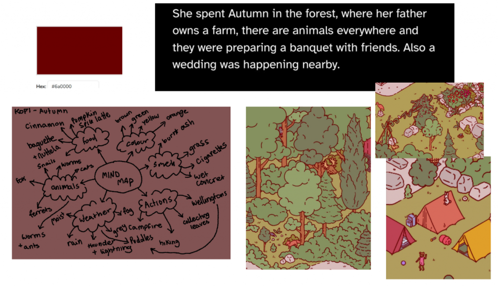
    In our first call together, I was given an overview and a summary of the game I was working on. I learnt its story, genre and premise. We decided according to what would be best for me and my portfolio, that 3 days a week I would begin helping Director/Designer Lucy conceptualise the character designs for this future rhythm game. We would begin with pre-production, mood boards and colour palettes, and then progress into design itself. Over the course of the next week, we curated various references to make a large collaborative moodboard on Figma.

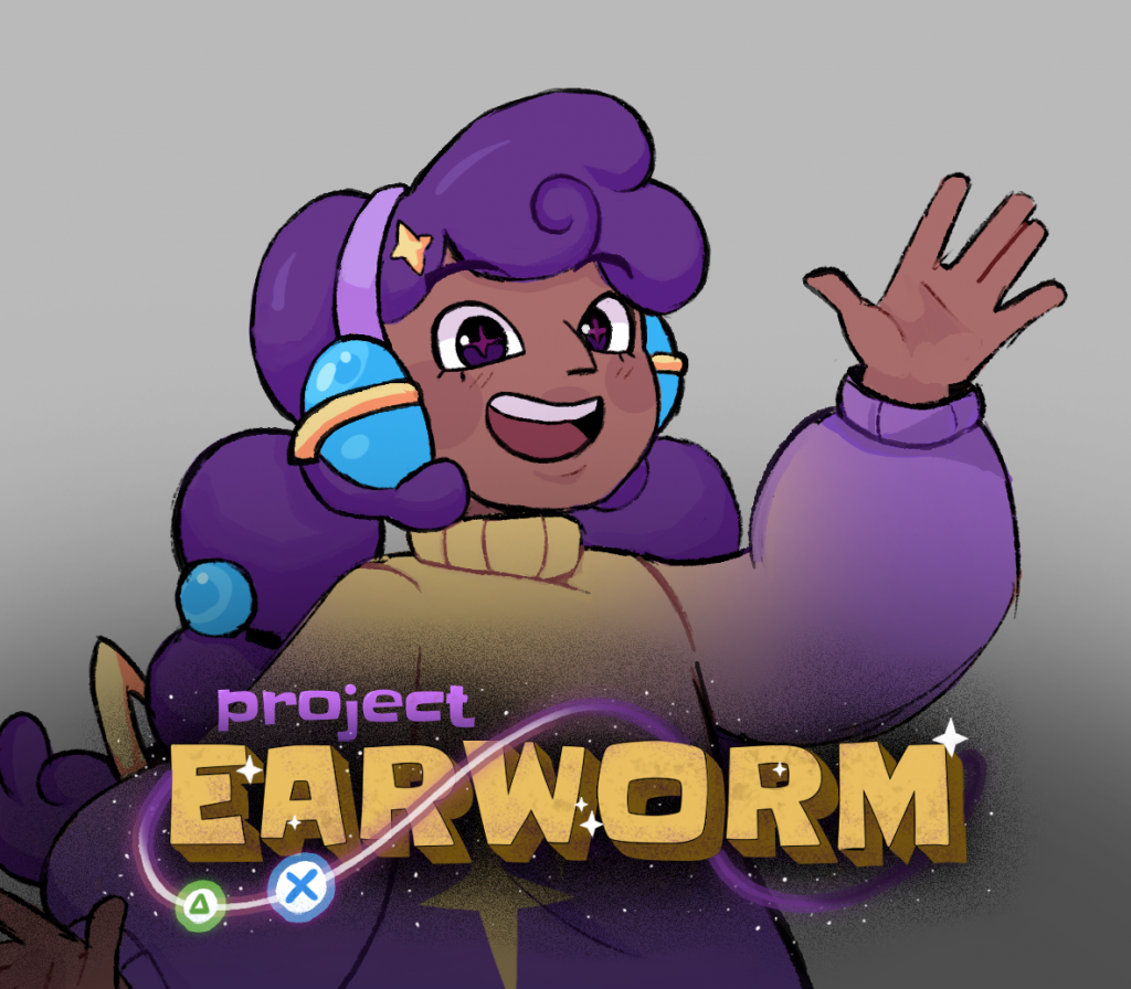
    The game, Project Earworm, is a Rhythm game about an evil earworm infecting a music-less earth. The protagonist Tae has lost her parents, using a new magical saxophone to fight different enemies and bosses, to find out what’s happening and where they went!

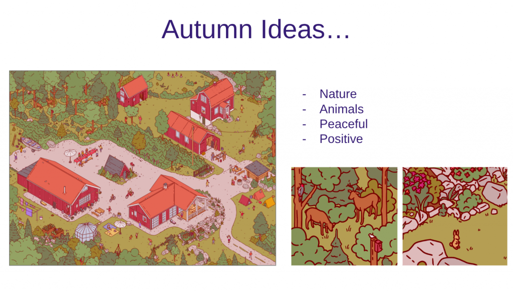
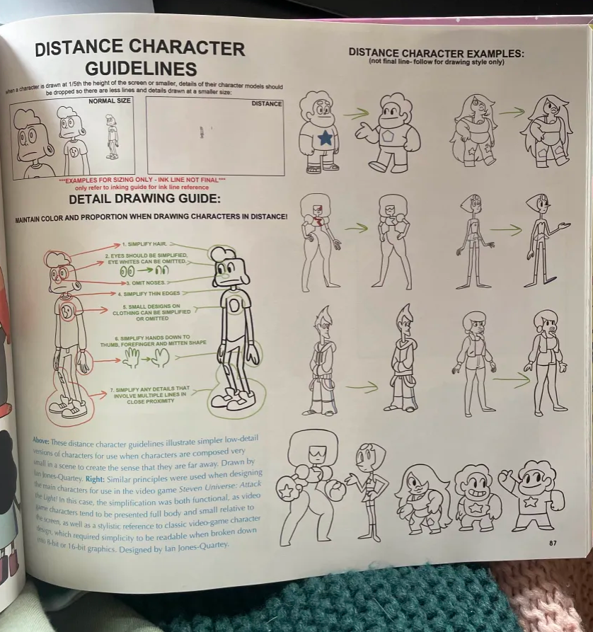
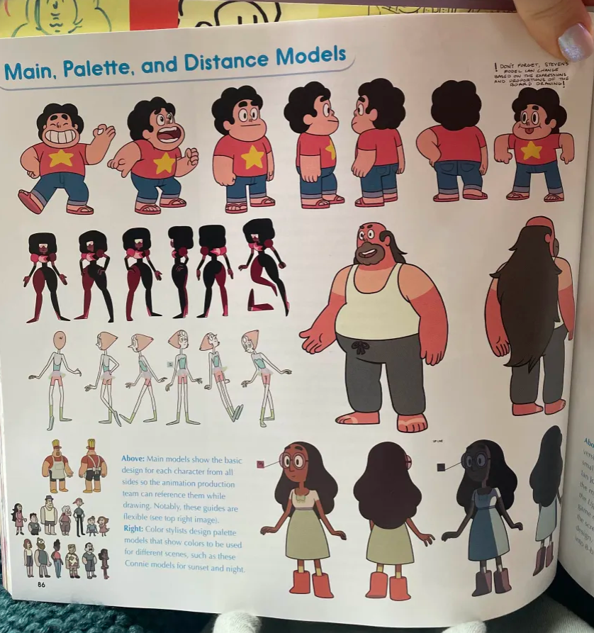
    The tone is intended to be humorous and playful, with magical elements and pop media references. This tone is reflected in the colour palettes we choose, and the softness of the shape language. As the game is set in 2.5D and involves a lot of animation, one of the biggest visual inspirations for the art direction is Steven Universe. I was sent excerpts from the art books to help get a grasp of the art style and aesthetic that Lucy wanted to portray.

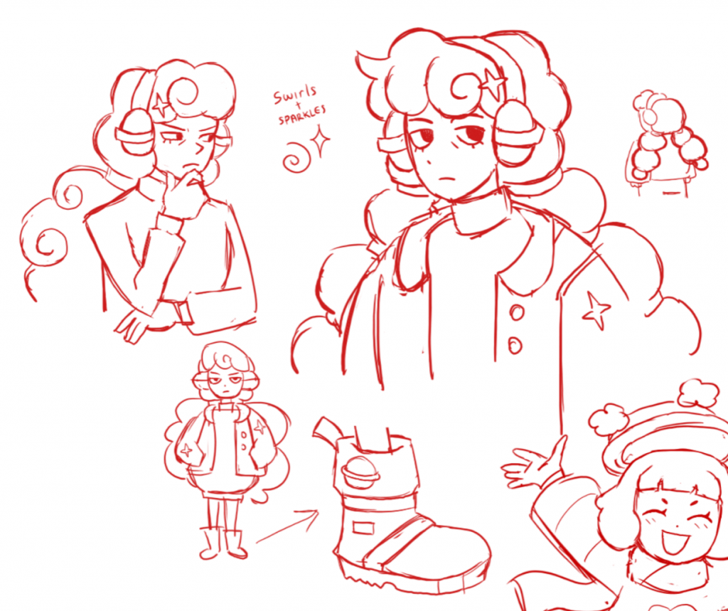
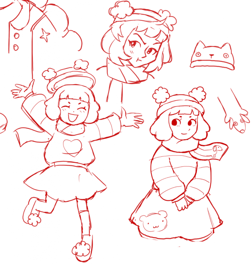
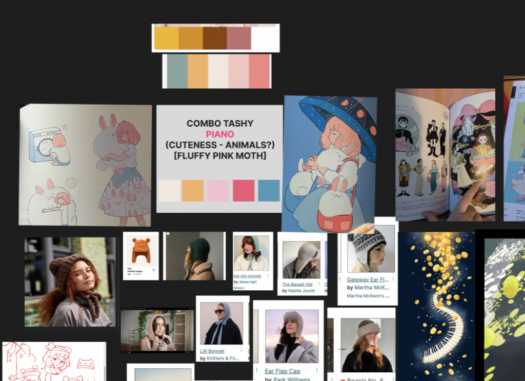
    I began making sketches of the protagonist, Tae, and her close friend Tashy (who’s bubbly and obsessed with knitwear). These sketches were loose and unrefined, based on Lucy’s old concept drawings for Tae. I wanted to get a feel for how the characters and their personalities could be before undergoing the full design process.


    Main Character Design – Tae

    Tae colour palette

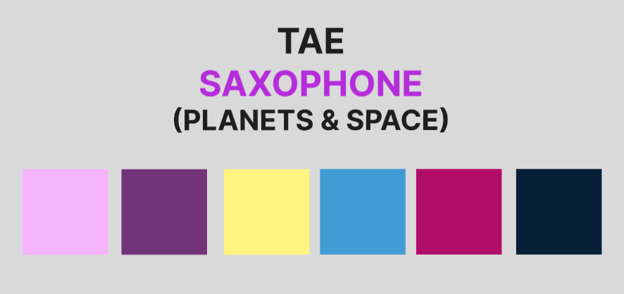
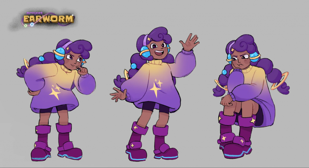
    Tae is a nerd who loves to figure things out, as well as space. She’s a bit of a skeptic due to her crazy parents, has curly hair, and likes to wear comfy clothes. With Lucy I helped create her colour palette. Her signature colour is purple, and involves pinks and reds, with a touch of spacey blue and starlight yellow.

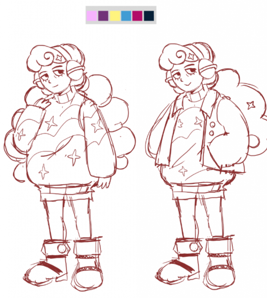
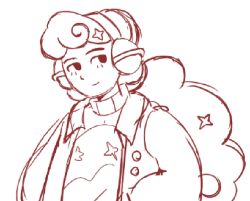
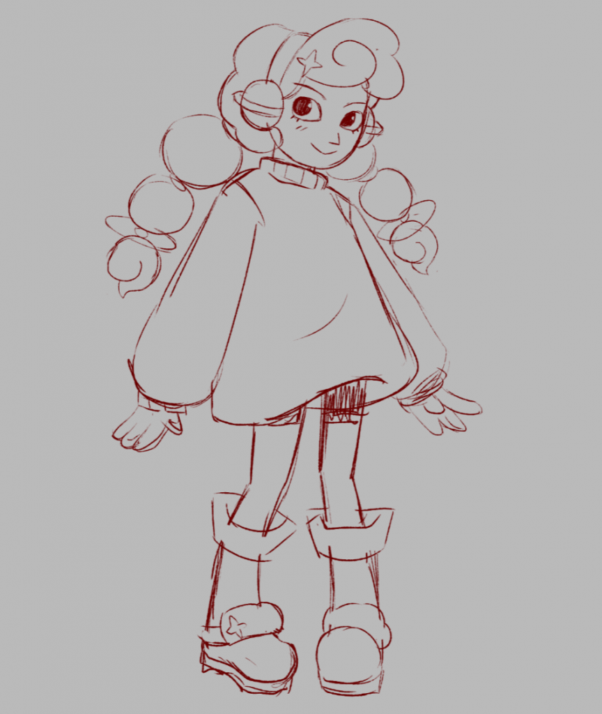
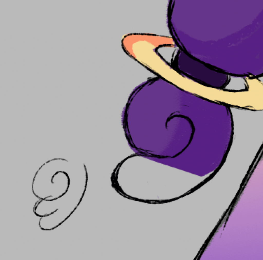
    My first Tae iterations show her in an oversized sweater and jacket, with moon boots and downturned eyes. She wears ear muffs made by her mother that resemble planets, and stars cover the rest of her clothing to portray her love for space. In one iteration, her hair is in pigtails and in the other it’s tied back ponytail style. When showing these to Lucy, she loved the pigtails idea- as the shapes in her hair resemble planets! We decided to go with that hairstyle moving forward. She also commented on Tae’s eyes, and we opted to go in a cuter direction.

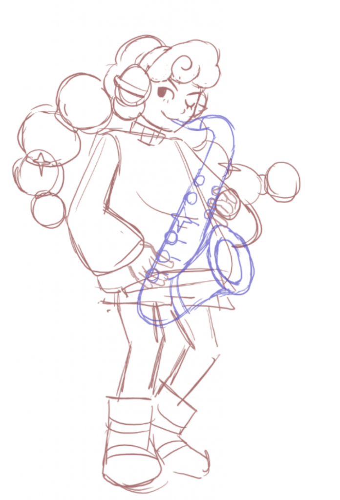
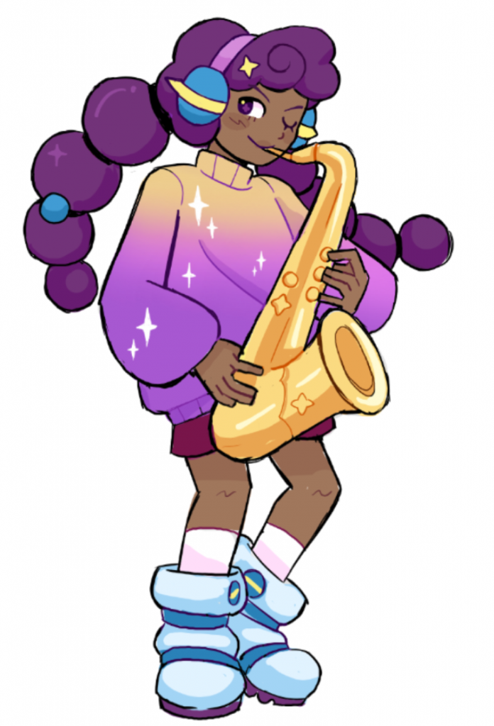
    This was my first full body design of Tae, with her magical saxophone. I tried to incorporate our chosen colour palette the best I could, but something felt off and I didn’t know why. Lucy then reached out to one of her friends in Animation, who helped give the design some critique. One was to make her skin tone a lot warmer, as her current skin tone looked too cool, greyish and out of place. Lucy also suggested we change the shoes, and take more references from real-life fashion. Here are some of my iterations for Tae’s boots:

    the pair of shoes we decided on

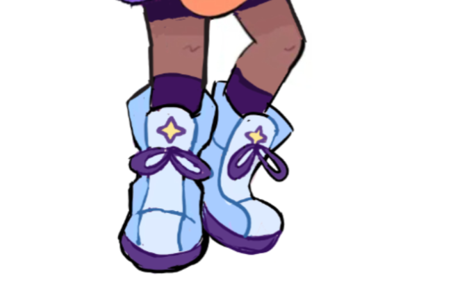
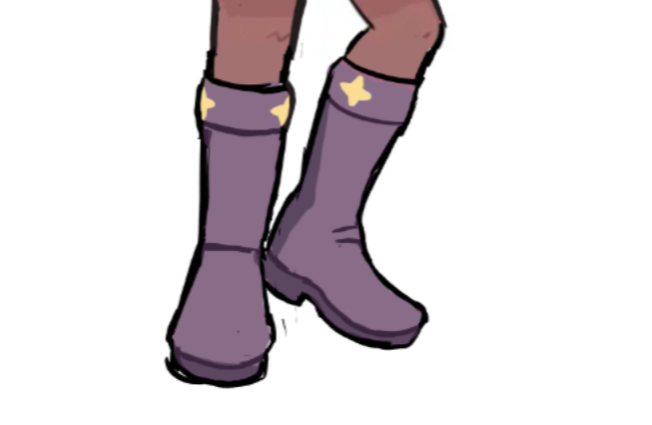
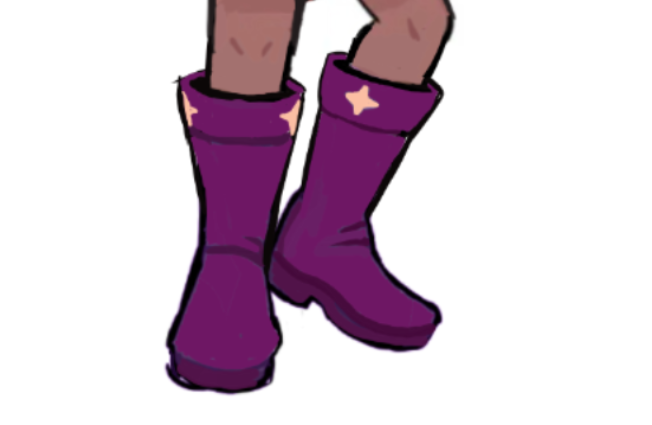
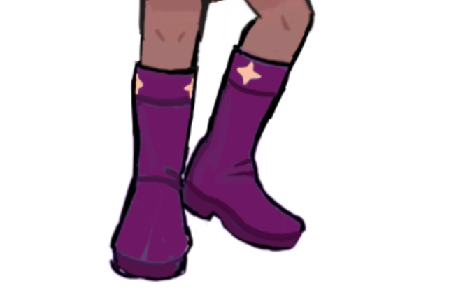
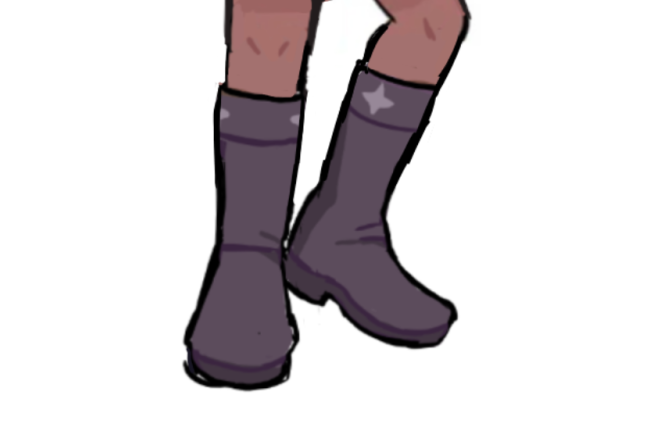
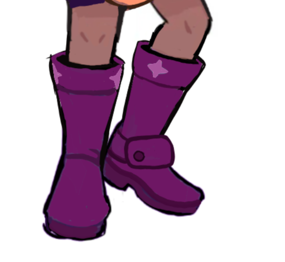
    The boots we decided on looked far better than the original moon boots, and with the adjusted colour palette- merged seamlessly together into one cohesive design.

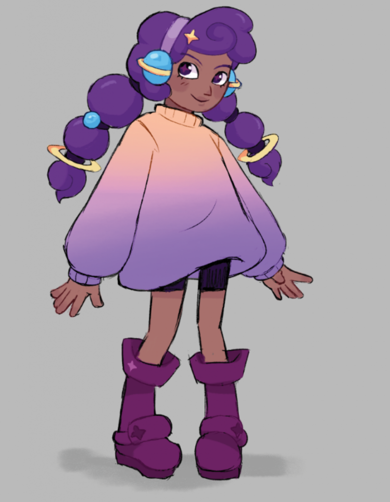
    Now, despite Tae’s style, hair and outfit being correct- we weren’t completely happy with her facial features or the style she was drawn in. We decided to move over to photoshop and re-evaluate how we were drawing her.

    Lucy was far more experienced at photoshop than me, so we had an entire session where she taught me all of her keyboard commands and how to organise layers and files in a professional setting. I was also sent a brush pack (Grutbrushes) so that I could use the same brush (Imp Linker) as Lucy and keep a cohesive look to our concepts.

    We decided to make the artstyle a lot bouncie, flowier and wackier. This decision came to us after discovering and watching Kaiba, an anime directed by Masaaki Yuasa.

    Kaiba

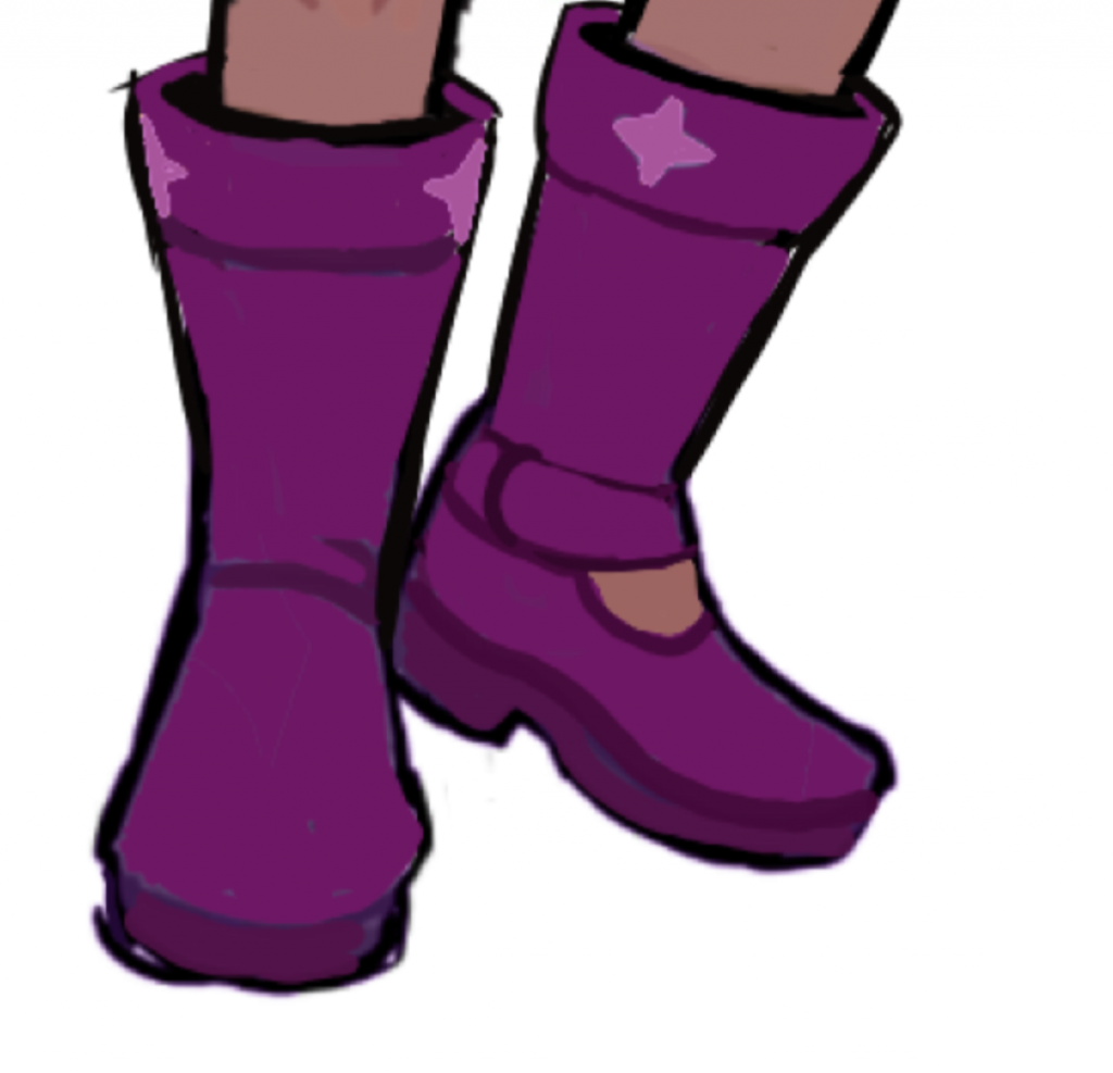
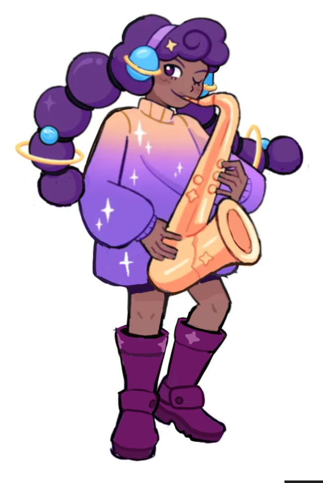
    For a revision of Tae’s facial features, we decided to give her a downturned nose and large eyes full of expression. I exaggerated the size of her sweater even more, and refined her silhouette. The boots also became extra chunky!

    new tae sketch on photoshop
    new tae with sax

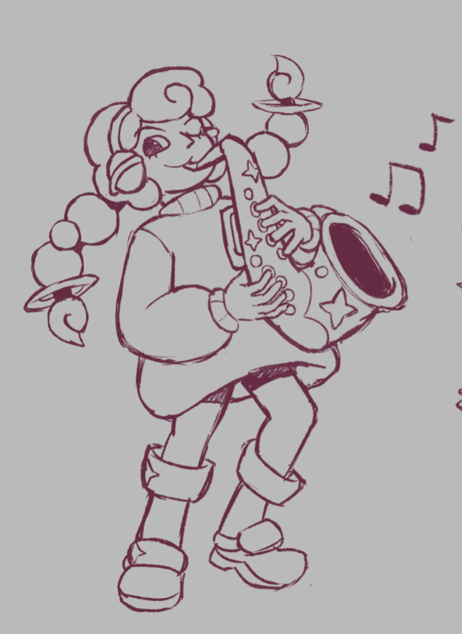
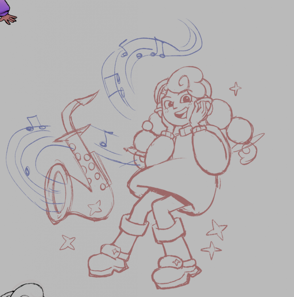
    I wanted to redraw the original full body pose of Tae with her saxophone in this new design and saw an overwhelming improvement in appeal! I asked one of my friends, a saxophone player, how to draw her holding and playing the instrument accurately.
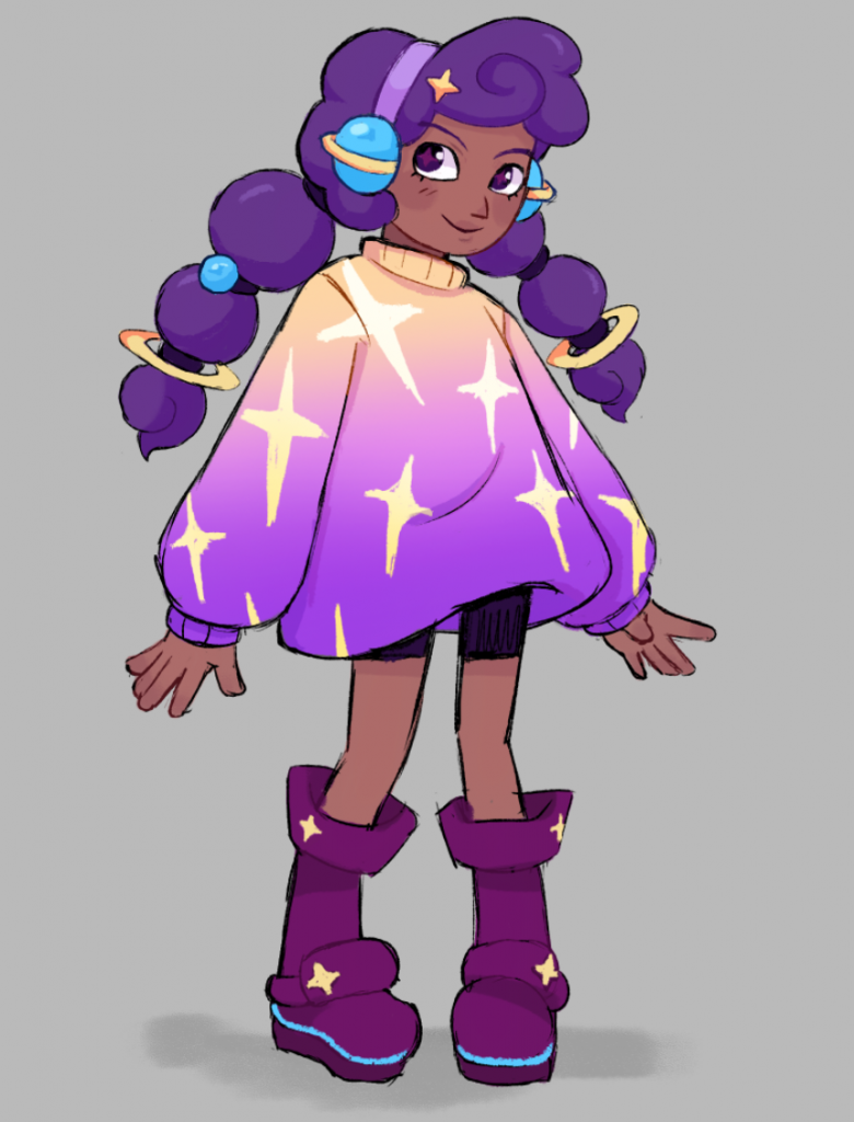
    Final Tae Design:

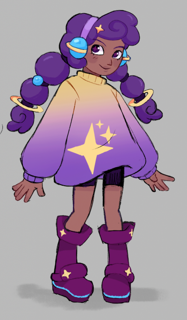
    We began to figure out her final colour scheme and sweater design. At first It was difficult to find the balance between too saturated and cluttered (upper left), and too muddy and dull (upper right). We decided to make the sweater gradient end in a rich purple, rather than magenta, and to have a few intentionally placed stars rather than a design with many.

    Another revision I made was to change the ends of her hair braids, giving them a poofier curlier texture to better portray her curly hair type.


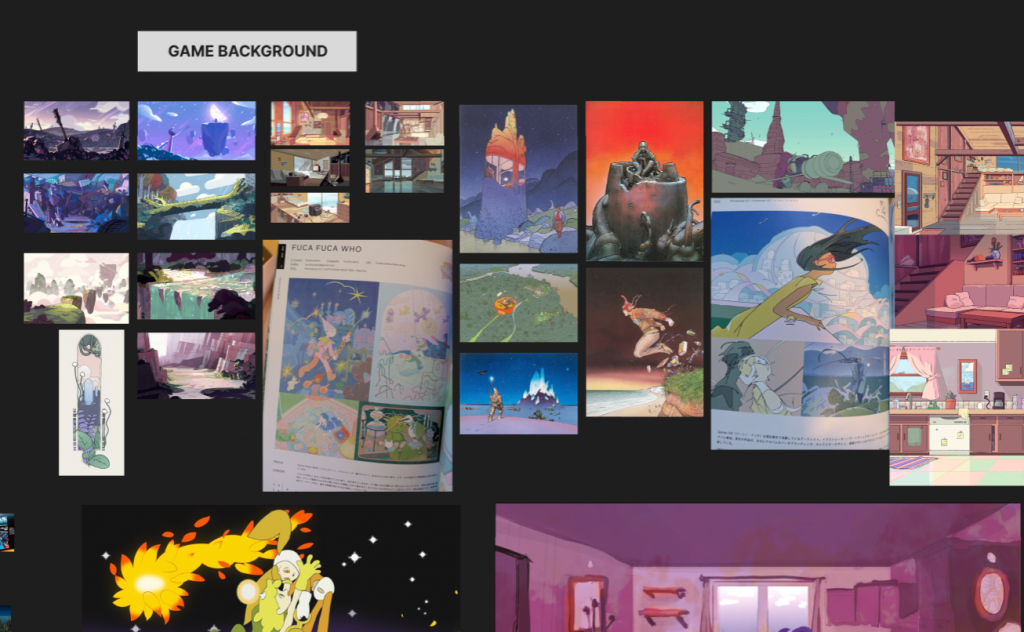
    Prop and background exploration

    Tae on a steven universe background

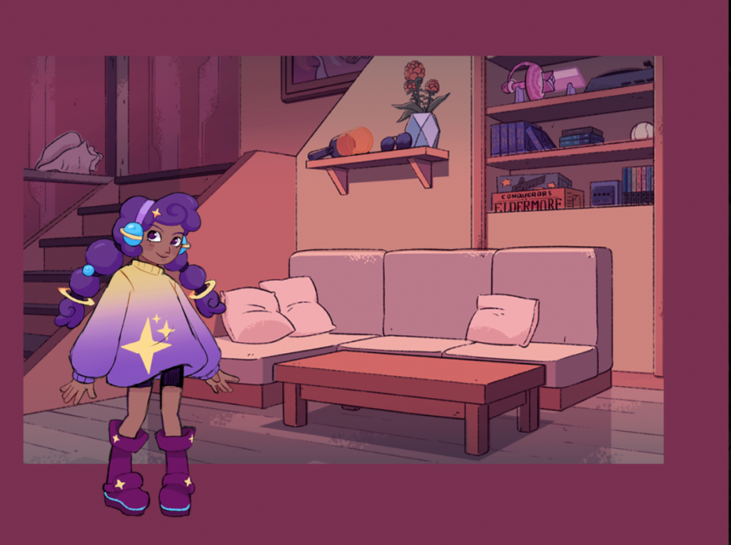
    Outside of character art and design, I helped with some background concepts. We took inspiration from animation reference, and began to imagine what the interior of Tae’s house could look like.

    my first attempt with just values
    colour and texture version

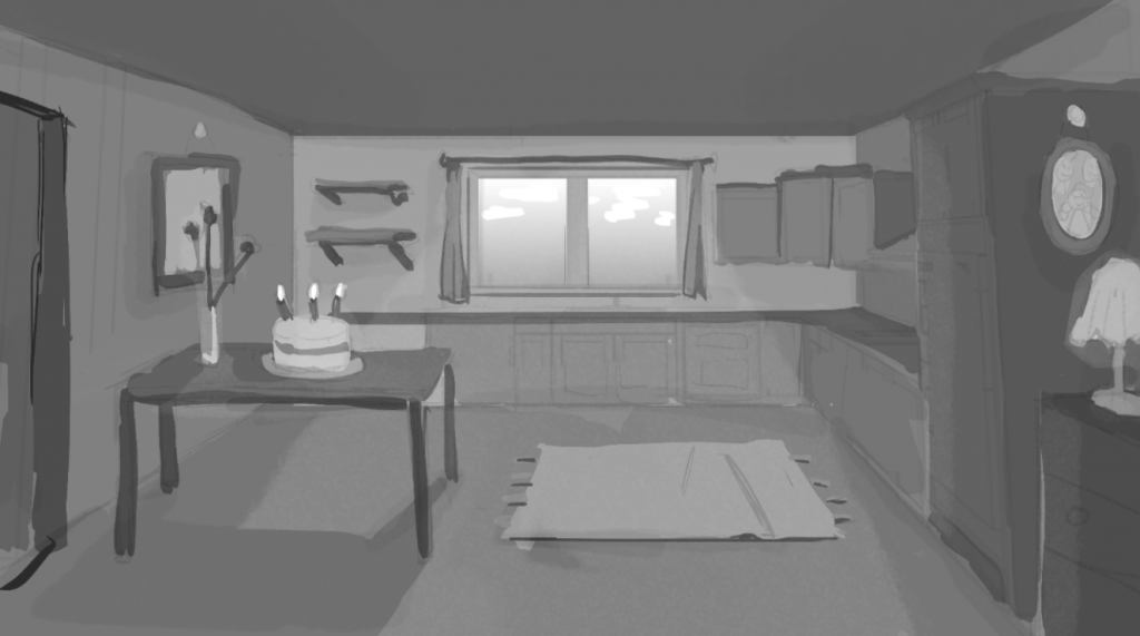
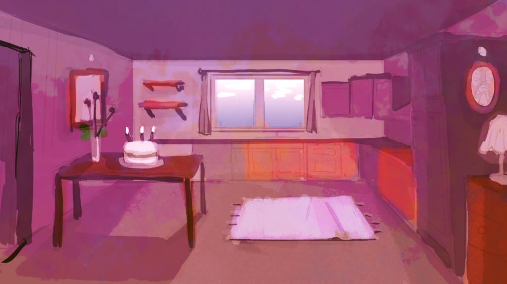
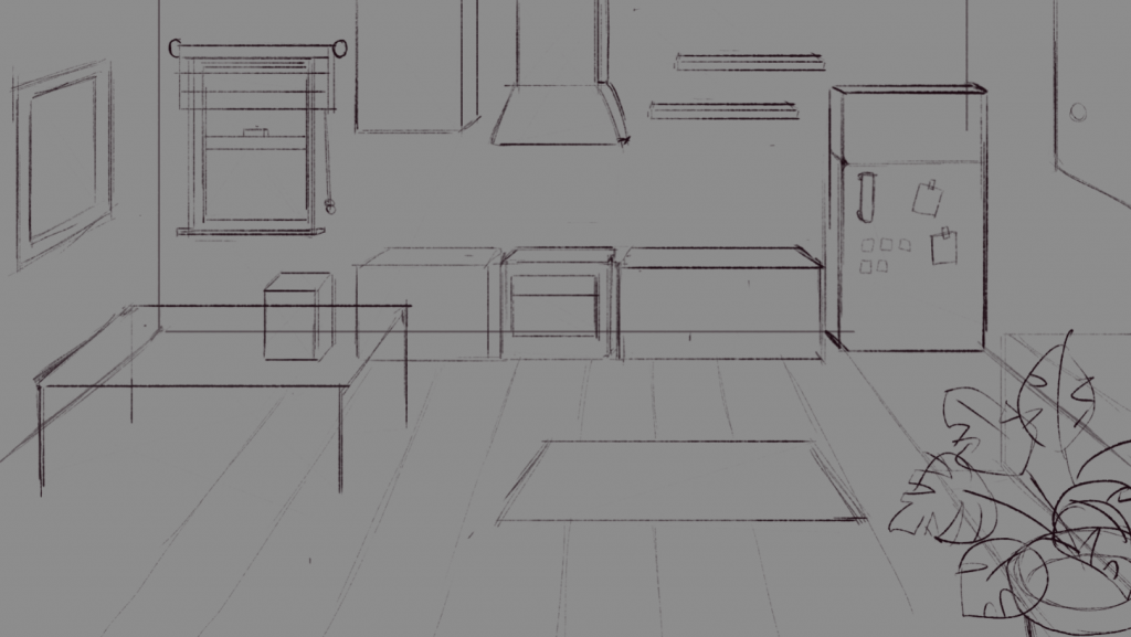
    My first backgrounds were very loose and painterly, keeping the kitchen scene as simple as possible. Unfortunately the lack of definition left the paintings feeling muddy and gloomy. I decided to retry with a much tighter use of perspective and guidelines, using line art to my advantage as well.

    kitchen perspective sketch
    colour and detail

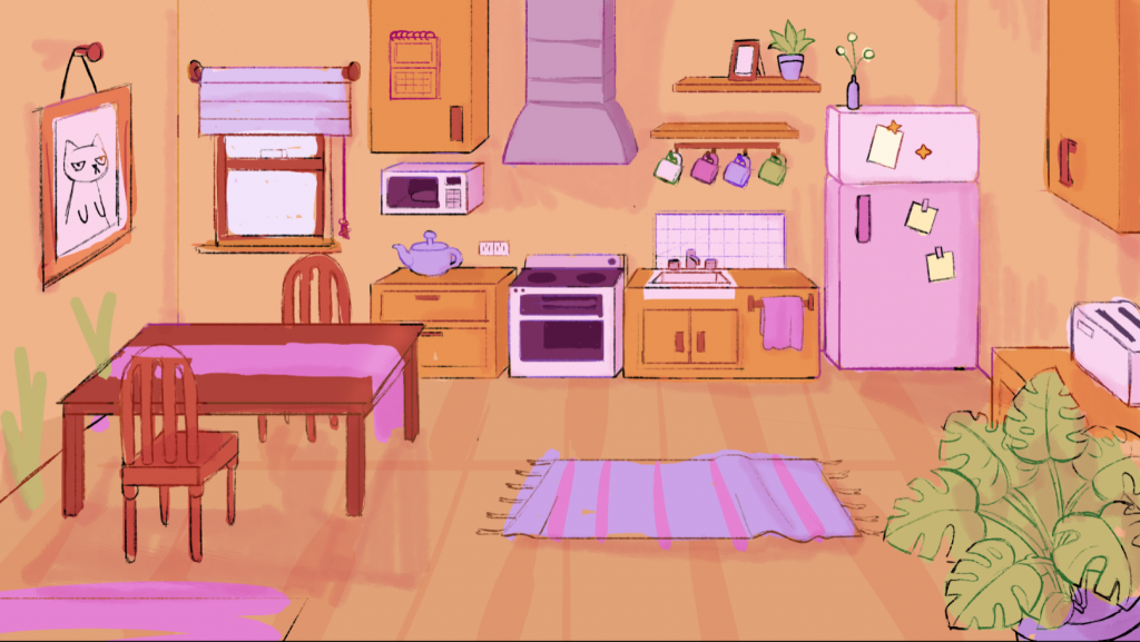
    My second background is far more successful. Although not perfect, with weird perspectives and nonsensical shadows… I think I did alright! As someone who doesn’t draw backgrounds or design rooms/environments often, this attempt was a step in the right direction. I was glad to have tried, and I believe my background carries a lot of charm.


    I also helped design some props. Particularly, the characters phones and Tae’s phone that would double as UI. We referenced cute phone cases, and the ways people customise their apps, charms and background screens into personal means of expression.

    early cute phone designs
    final phone concept

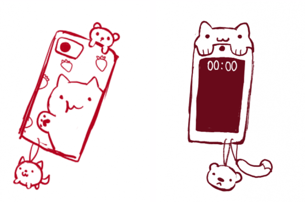
    I wanted Tae’s phone to showcase her space interest. The camera is replaced with the star motif seen on her jumper, hair clips and boots.


    Secondary Character designs

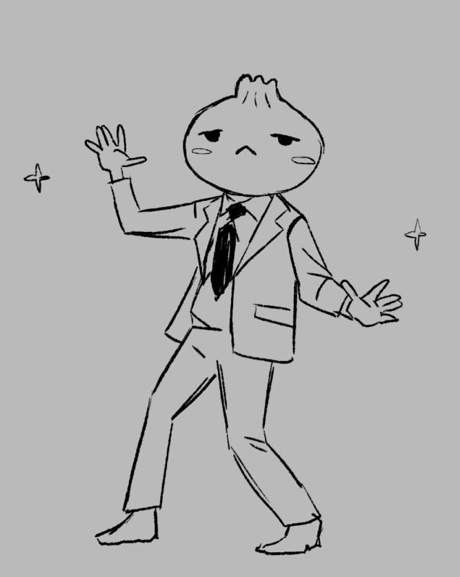
    I helped design the first boss and some of the enemy designs of the first level. The music inspiration for this was Jpop, and the level boss would be an obsessive idol stan who cant stop dancing! Here is a moodboard Lucy put together to help me visualise the characterisation.

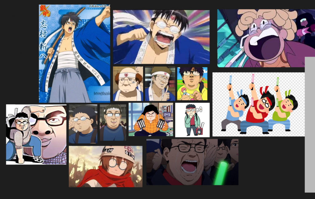
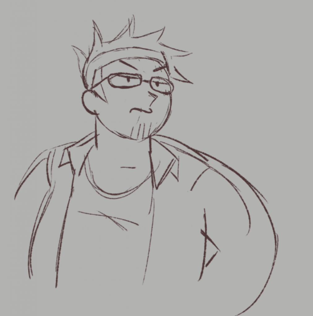
    My first few sketches were pretty tame. Lucy emphasised that she wanted him to look less nice, and far more crazy! We also discussed that the level would be set in a supermarket, and that different foods would be dancing along to the music as well. I was to incorporate these food themes into his design.

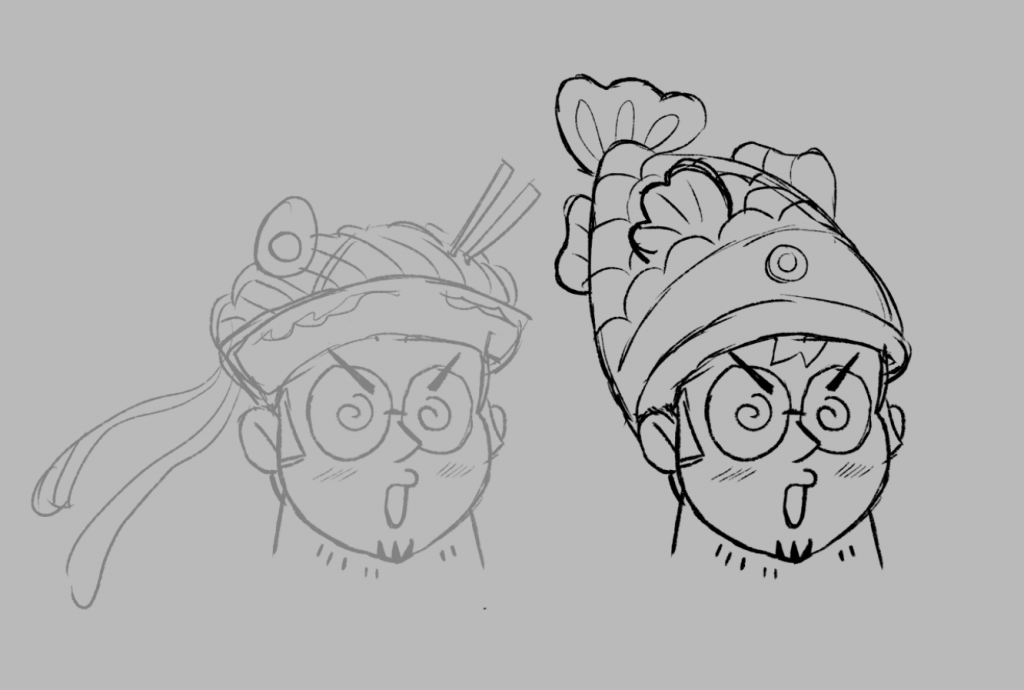
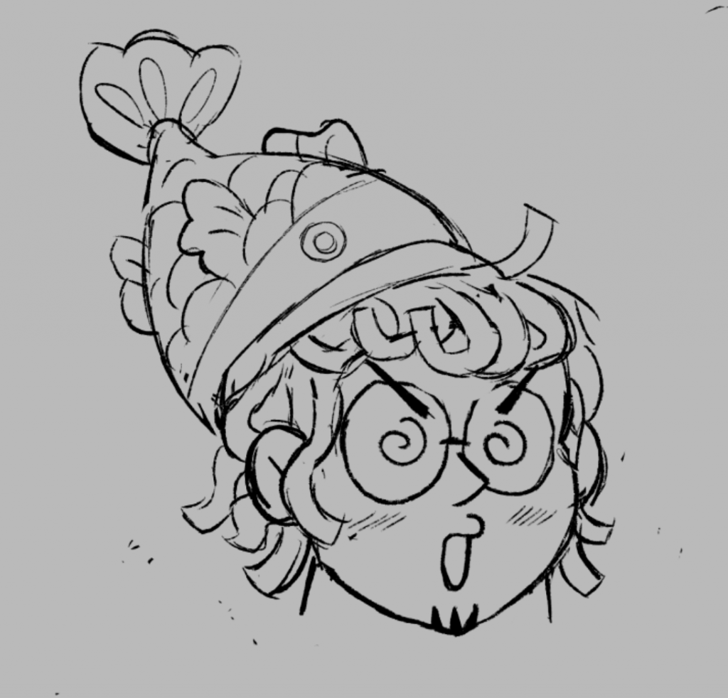
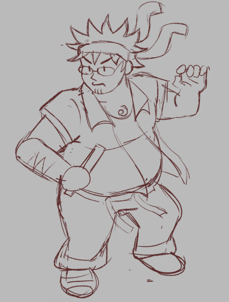
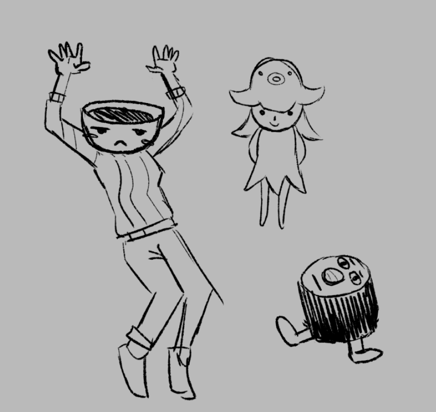
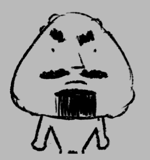
    I started by turning his hair into a ramen bowl, then making a taiyaki eat his head. I then turned his hair into actual noodles! and this was why the taiyaki saw his head as a tasty treat.

    boss guy final design

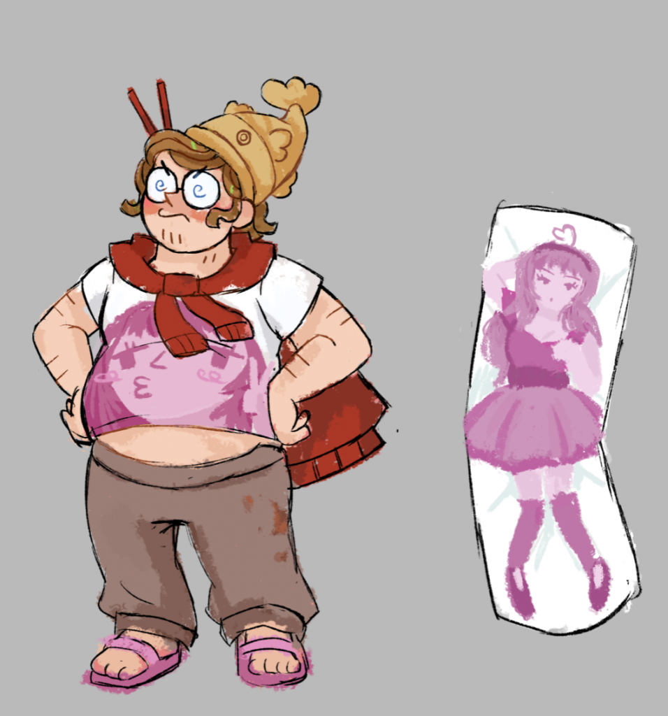
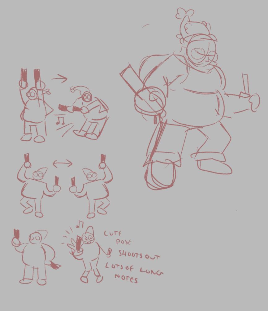
    Now that i had a starting point, it wasn’t difficult to figure out the rest of his design. Because he’s a villain our protagonist is trying to defeat, I tried to emphasise the worst aspects of idol fan culture (creepy obsession and usually lack of deodorant) in the way he looked. I made some sketches displaying his move set in the game, waving light sticks around and dancing wildly.

    moveset concepts

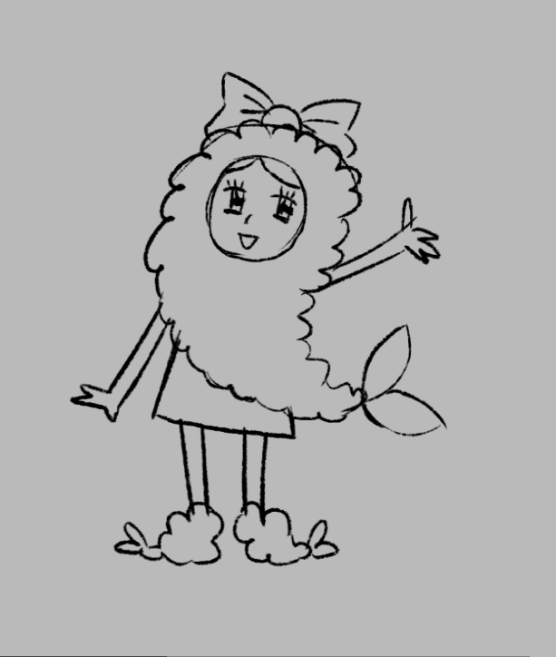
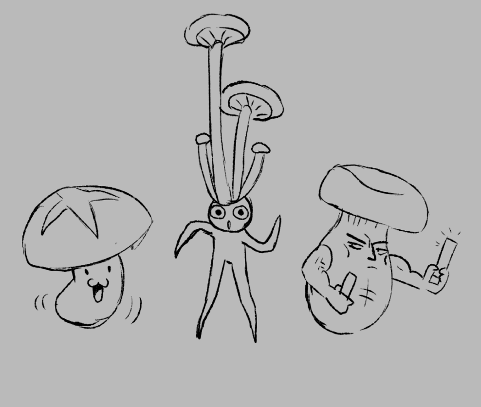
    Here are a bunch of wacky concept sketches I made for the food people/enemies that would be dancing with the boss in the level.


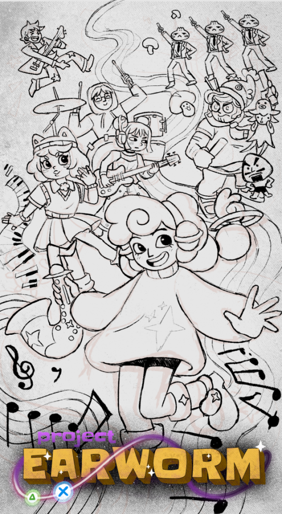
    Promotional art concepts

    Now we had a cast of characters (I can’t discuss them all In this blog entry) I was given the job of conceptualising a promotional poster. It was difficult fitting so many characters cohesively into one scene with enough flow to make a dynamic composition. Two of my thumbnail sketches are below.

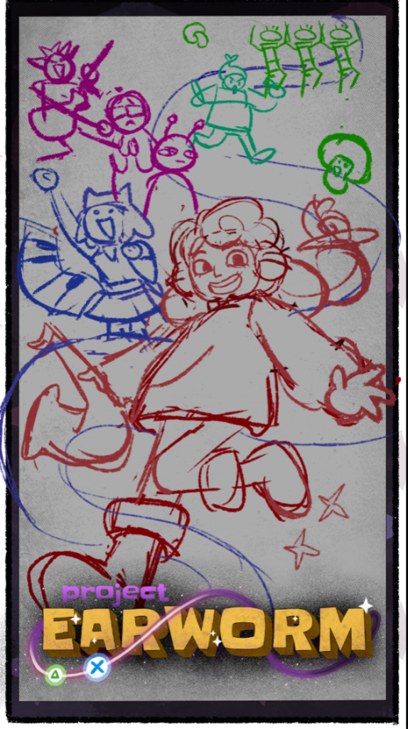
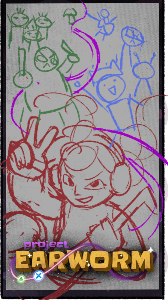
    In this design, I really wanted to emphasise the music flowing between Tae and her friends against the villians/enemies.


    Tae Turnarounds, Gestures, and Portfolio Pieces!

  • Blink Industries – Nippets Logo


    Introduction

    One of my most important, and most challenging live briefs that I completed during my DPS year was with Blink Industries. Our job was to design an animated logo in the style of their newly released game, Nippets – a 2D hidden object game inspired by the joy of people watching! In teams of 2-4, we redesigned the Blink Industries logo to resemble one of the four seasons in the game, and then brought it to life through animation. These animations would be shared on social medias as promotional works, with us tagged as collaborators and artists upon the games release.

    In this blog entry, I will be covering the entire experience from concept, to our screening at the Blink Industries Studio!


    Blink Industries Briefing

    Nippets cover artwork

    To deliver our brief, the Nippets producer Nicola Strina visited LCC. He started by introducing himself with a talk on the current gaming industry, discussing how they’re pivoting into making smaller games with much tighter development times, scope and budget. He discussed the importance of a quick validation cycle, and how it’s important to build a community excited for release. Such strategies can be seen in games like Peak, Buckshot roulette, and a game about digging a hole. These strategies are how they made Nippets!

    We were then introduced to our brief In full, to redesign the Blink Industries logo (shown above) in the Nippets seasonal styles (backgrounds shown below). This logo would also be animated, to be posted on social media. Here are some notes from the brief:

    • The animation should loop seamlessly
    • The animation should have a transparent background (although make sure that it works well with a background)
    • Keep the logo recognisable at all times
    • Do NOT redesign or turn into a character
    • Allowed: subtle motion, environmental effects, seasonal VFX

    For inspiration, we could look at the Blink Industries Idents that had been made in collaboration with art students for previous years.


    Concept

    Once the briefing had concluded, I made a team together with my fellow DPS students Amy, Kofi and Pelin. When taking a closer look at the seasons, we decided to settle on Autumn as our theme and began brainstorming all the different ways we could convey the season.

    screenshots i collected of the demo for research
    hex code, autumn description, reference images and mind map (by Kofi)

    Over the next couple of days, we each played the demo and analysed the visual style which was a combination of frame-by-frame and tweening. We were given the hex code of the line art, and told to keep our lines as accurate and consistent as possible to the game world. We looked closely into our autumn reference image, and picked out aspects of the image that we found interesting. In particular, we wanted to focus on nature and the presence of a wide array of animals! We collected words associated with autumn, and coordinated a pinterest board.

    I started the design process by transforming the original Blink logo into something that could be present in Nippets, giving the logo a rounded outline in the colour we were provided with. I sent a transparent, line art only version of this logo to the rest of my team to help us kickstart our design process and get to making iterations. We decided to each come up with our own iterations to start with, as to make as many ideas as possible at this stage and then refine them later. We’d be showing our first set of idea’s to our tutor, Joshua, in a meeting coming up soon.

    Kofi concept sketches
    Amy concept sketches
    My initial concept sketch

    A few of our first ideas involved incorporating a scrolling day to night cycle that loops through the Blink banner, leaves flowing throughout the letters, and animals that interact with and pop out from the lettering. We kept our colour palette very cozy. When we showed these first design ideas to Joshua, he gave us plenty of good critique.

    • tie your ideas into Blink Industries identity
    • colour pick from the autumn reference image
    • Increase saturation and add more visual interest
    • choose statement colours
    • work on contrast and values, variations in lights and darks
    • make certain aspects bigger and others smaller, breaking up the sizing will make each aspect more readable
    • consider the actual movement styles, not just what’s happening
    • consider different effects and textures

    He also gave us advice for our eventual pitch meeting with Nicola.

    • Pitch 4-5 separate ideas and be open to conversation
    • crop it to aspect ratios, show it on light and dark backgrounds for posting on social media
    • be confident, rehearse and take turns
    • research blink beforehand so you can accurately apply your ideas to their identity
    • keep slides neat, stylised and easy to read

    With this advice in mind, we went on to create more concepts!

    Iterations by Amy
    iterations by Kofi
    screenshot from Pelin’s bird animation
    my iterations

    We decided to stick with the main theme of nature, every one of our ideas keeping it at the forefront. For my idea, I wanted to reference the gameplay of Nippets directly by adding a cursor. This cursor would click on parts of the logo, causing different animations to play, much like how the game itself operates. For example, when the bush is clicked a moose will pop up, and a bird will fly out from the bird box. I transformed the Blink banner into a flowering bush, and designed a path that flows through ‘industries’ to change the interior of the letters into a small scene.

    Following Joshua’s advice, I made sure to vary the detail and sizing throughout my logo. I kept the colour palette of the logo itself majority green, so that the important animated assets and animals that are brown, red and orange would be able to pop out against that backdrop.


    Midway pitch presentation

    Happy with our range of ideas, we began organising our presentation.

    notes I shared in the team discord

    For our presentation, we created a title slide, a brief research slide and an X slide. We then showcased our work, and added extra slides after each idea to display how our ideas would look on different shades of backgrounds and posted to social media. As pelin had an animated video to share for their bird picking up an apple idea, I uploaded the animation to an unlisted YouTube video to embed in the presentation. I did the same for Kofi and myself. This way I could play the videos seamlessly during our pitch! We each practised what it was we wanted to say, and before we knew it- it was time for us to show our work to Nicola!

    informational slides from our presentation

    Nicola appreciated our work and let us know which aspects from our iteration to follow through with for our final design. He decided that my moose concept was the strongest base, but emphasised that Pelin’s bird animation would be a great addition. For critique, he brought to our attention that our logo designs don’t have any people in them- and Nippets is a game about people watching! It would be a great idea for us to add people, and so Nicola suggested that we add a person passing across the screen through the scenery/path inside the letters. He loved the cursor idea and the link to Nippets gameplay, mentioning that it would be even better if we added more aspects to the design so that each time you watch the loop there’s more to discover.


    Refining our Design

    We then had another meeting with Joshua, who gave us several critiques:

    notes on Joshua’s critiques

    Our next step was honing our design following the guidance of Nicola and Joshua. We focused on adding people and extra detail, carefully considering how everything would move.

    iteration by Amy
    Movement ideas and additions by Kofi
    Iteration by Pelin
    combined iteration design by me

    Amy placed people inside the letters, children passing a ball between each other inside the letter and back out again. Kofi conceptualised the overall movement, Imagining how the bunny rabbit would move from letter to letter. Pelin organised extra props and detail, filling out the scene with the addition of plants, washing and a fishing rod that would all sway gently in the animated breeze. I then combined each aspect into one image! At this point our logo felt far more developed, but the amount of detail felt overwhelming. Thankfully it was time for another round of critique.

    notes on Joshua’s critiques 2

    I began making adjustments immediately- shrinking and redrawing the washing line so it was less cluttered and removing some unnecessary props. I changed the rabbits positioning, and made sure the lines of the path were now defined and clear.

    Final Logo Design:

    our final design!

    At long last the logo we would be animating was complete! At this stage I was very proud of our progress so far, loving our design. I was also very intimidated… it was going to be my first time animating on this scale, and my first time ever using after effects.


    Animation

    our checklist of animations

    We began organising how our animation would look, how each aspect would move and who would be animating them. Pelin focused on their bird animation, refining it and using the new design where the I of Industries has been transformed into a berry. Kofi was working on the rabbit, doing the frame by frame animation of it hopping back and forth between the letters. Amy was animating the children passing the ball backwards and forwards.

    My job was to animate the cursor clicking the I, and the moose rising out from behind Blink, chewing on the leaves of the bush before disappearing once again. I was also the compositor, in charge of putting each individual animation together into one file. I also animated the smaller details, the plants clothes and fishing rod swaying in the wind. The birds pecking up and down, and the mole popping in and out of the earth was also up to me. For this, I would be using mostly pan animation and tweening as to not overwhelm the viewer, the bird and rabbit would be our main frame by frame aspects.

    Despite being the compositor, I had never used After Effects before and would be learning how to use it entirely on the job. I watched a ton of Youtube videos on the process, starting with exporting our combined logo design over from Photoshop whilst preserving all the individual layers. To add the animations of my teammates, I learnt how to use colour keys to remove backgrounds.

    For my moose animation, I used squash and stretch to exaggerate the moose retreating back behind the bush. I also added leaf particle effects that fly outwards when they raise, playing with the spacing of key frames and the level of opacity to make them fade away.

    our after effects file i was working on

    It was incredibly challenging putting everything together and bringing the png sequence of the rabbit into the file as the animation was very small with pixellated line art over a background that wasn’t yet transparent. After adjusting the settings of the colour key I was able to get a satisfactory result, ready to show Joshua for more critique.

    You can see the first version of our animated logo in this video:

    notes on Joshua’s critiques 3

    Joshua’s main critique was to add more particle effects. Instead of the leaves disappearing, they could settle at the bottom of the bush and last for the full animation loop. When the rabbit jumps, particles should raise from the letters showing the impact of the landing, and the paws scuffing up the grass/earth. When the cursor clicks, there should be particles as well to emphasise what otherwise is a pretty subtle movement. We were also given tips on how to make the animations more natural, one way being to make the bird pecking less rhythmic as birds pecking in real life is a lot more sporadic and fast. The berry should hold its volume when it squishes, instead of collapsing completely. The ball being thrown currently feels weightless, so it should be animated with a lot more speed and weight/impact when it lands in the characters hands.

    We were now in the final stretch. It was time to use these last pieces of critique to elevate our Logo to our best ability and finalise it. We made sure to check if it stood out against our Autumn background, and thankfully it did!


    Final Animation and Screening

    Here is our final logo animation, looped for a minute:

    I am incredibly proud of myself, my team and our end result. When starting DPS, I never thought i’d be picking up an animation/editing software like this and making something so polished in it. I’ve never done logo design before either, and so having such a strong first attempt is very exciting.

    Now our animation was finished and uploaded to Onedrive, it would be screened at the Blink Industries Studios where we’d be getting a tour!

    our logo at the Blink Industries Screening

  • Rose Wylie: The Picture Comes First


    went to the Royal Academy of the Arts to go see Rose Wylie: The Picture Comes First. Rose Wylie creates bold paintings of her memories, alongside the things she finds interesting. Her work is full of cinema references, snapshots of her own life, memories of the Blitz, and anything that she thinks would make a good image.

    Her work is often humorous. Looking at her paintings, I found myself smiling- wondering what had inspired her to create an image of this size and scale. My favorite painting is this horse (pictured above) with nonsensical anatomy. Having attended art school, Wylie was taught anatomy and other fine art skills to make her become a successful artist- however in this painting of a horse, the labeling of the anatomy purposefully makes no sense. She expresses herself through defying the rules of fine art, showing her freedom to create an image she finds appealing.

    In another of my favorite paintings (pictured above), Wylie depicts Lilith. Lilith is a figure in folklore said to be the wife of Adam before Eve, made from the same clay as him. However, she refused to be subservient to him, and left him instead. Lilith is often described as the First Feminist. It was this same story that inspired Wylie to make this painting, after realising she had seen a terracotta plaque of Lilith, the Burney Relief, once before in the British Museum.

  • Tracey Emin: A Second Life


    Recently I went to see Tracey Emin: A Second Life at the Tate. The exhibition displays a lot of her most iconic work, including My Bed. Her work often features the female body, where she displays feelings of pain, healing and self-expression. Her art is incredibly personal, and pushes many boundaries.

    I found the exhibition incredibly intense, so much so that I only took one photo the entire time I was there. I won’t go into any more detail. The experience was heavy, but in it I was reminded of the power of art and how it can be used as a tool for such honest and powerful expression of the self.

  • Wes Anderson: The Archives


    Wes Anderson: The Archives is an exhibition devoted to Wes Anderson’s distinctive cinematic output and style. It was filled with storyboards, Polaroids, sketches, paintings, puppets, miniature models, and dozens of costumes. As a character artist, it was incredibly interesting to see behind the scenes of these movies- especially the stop motion models and puppets and the concept art behind them.

    Having grown up watching fantastic mister fox, it was fascinating being able to witness behind the scenes. The animation puppets and sculptures were incredibly detailed and full of character, each so distinct and carefully considered in their appearance and wardrobe. As someone interested in 3D modelling, I loved getting a chance to see them up close and not just in photo and video. I’ve always loved animated characters, and wish to bring the same charm to life through my own designs.

    The costuming and set design was also incredibly inspiring. Wes Anderson has such a distinct use of colour palette and composition that is incredibly appealing to the eyes! Its lovely to see how every prop and set piece is crafted with care, and makes me imagine what a pleasure it would be to work alongside other creatives in such a way. It made me ever more determined to pursue my creative practice and make my own stories and worlds.

  • The Genesis Exhibition: Do Ho Suh: Walk the House


    In October I visited The Genesis Exhibition: Do Ho Suh: Walk the House at the Tate Modern. Throughout the exhibition, I was made to question what “home” really means. Is it a place, a feeling, something we carry with us? The exhibition explores that relationship between architecture, space, the body and memory. My favorite part of the exhibition was walking through Suh’s colourful mesh sculptures! Aside from just being colourful and immersive to explore, these see-through rooms and buildings captured the essence of nostalgia, preserving past memories and experience.

    As well as the large installation, there were smaller works of illustrations and videos. The artist shares his life of travel between Seoul, New York and London homes, Inviting us into his memories and the spaces they occupy. I left the exhibition considering how identity is shaped not just by where you are, but by the spaces you carry with you.


  • Life drawing with Lee Townsend


    statues inside the British Museum

    On the 18th of April, I was lucky enough to get a place in a life drawing session run by Lee Townsend. Lee Townsend is a professional illustrator of over 30 years for comics, books and films. As a comic artist he is very experienced at life drawing, capturing the human form in all sorts of gestural poses.

    Our task was to draw the many statues in the British Museum. We did both longer poses of around 15 minutes, down to much shorter less detailed drawings for 2 minutes. Lee encouraged us to focus less on the details and more on the pose as a whole. When looking at my figures, Lee helped me correct anatomical issues and encouraged me to place guidelines to carve out the forms. He taught me that there is often a line between the shoulders, and a line between the hips- and that in poses, they are often leaning in the opposite direction to balance weight.

    The museum was incredibly busy! Many tourists came up to us to ask us what we were drawing, and to take a look at our work.


  • Unity Visit


    As a Games Art student, I had a chance to go down to Brighton and visit the Unity hub there. We listened to a variety of game-related talks from programming, to careers, to technical art! It was an exciting chance to see inside the offices and experience an industry environment.


    Everyone at Unity was very passionate about gaming. Our first talk with Oliver Rosten taught us how to use programming principles through everyday problems in his presentation ‘what a DIY disaster can teach us about coding’ and ‘What can cooking teach us about coding’, it was a very interesting way of looking at how programming knowledge can apply in other situations- it was also very easy to understand for non-coders like me!

    Our second talk was ‘Made With Unity’ with Liz Mercuri. Then we had a talk about Unity careers from Iwan Jones before an in-depth lesson on Technical Artistry from Joel Garcia exploring shadowing. We also had the Unity CEO give us a call!

    It was a wonderful day, packed with information (and free coffee and snacks).


    Return to Home Page

  • Industrial Light and Magic


    My second week of DPS began with a trip to Industrial Light & Magic. Here, we got a glimpse at how the animation for many blockbuster movies are made. We signed in, and were taken into a theatre to be presented with a talk from several of ILM’s employees. Each member outlined their own creative journeys, and how it lead them to working at ILM- one having started out as a Game Artist at UAL!

    We were informed of several ways to start at ILM, These included:

    • Jedi Trainee
    • Runner
    • Scouted via social media

    These opportunities target new graduates and those wishing to break out into the industry.


    Return to Home Page

  • London Games Festival – New Games Plus


    On Friday the 17th of April, I went to New Games Plus!
    New Games Plus is a part of London Games Festival, a showcase of new and upcoming video games from a variety of indie developers. Over the course of my time there I would be chatting with developers and other members of industry, handing out business cards, and playing a whole bunch of games with my friend and fellow DPS student, Pelin.


    My objective for the day was to put myself out there and network, talk to lots of people and hopefully hand out a few business cards. This was pretty challenging, as i’m still very new to spaces like these- my only experience prior being Develop Brighton. Luckily, I had come prepared as my mentor Lili (who you can read about here) had already given me plenty of top tips on what to say!

    One of the first booths we approached was of Museful, a game by Nostalgicat where you play as a little lizard painting the world colourful. I loved the painterly style, and had a chance to speak with the developers and artists behind the game. After following them on Instagram and picking up some stickers, we exchanged business cards so that we could follow each other on Linkedin and socials!

    Another booth we approached was GodsTV by Melbot. After playing for a while, we struck up conversation with the social media manager, who talked us through her role on the team and showed us some incredible art assets and character designs. I shared my busines card with her, and we followed eachother on LinkedIn as well.

    Whilst there, we also saw the Nippets booth and Nicola Strina, who we worked with on a live brief (you can read about it here) ! He let us know that next week the social media team would be posting our animations, hooray! We also met The Lamb from Cult of The Lamb.


    Return to Home Page