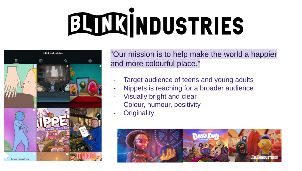
Introduction
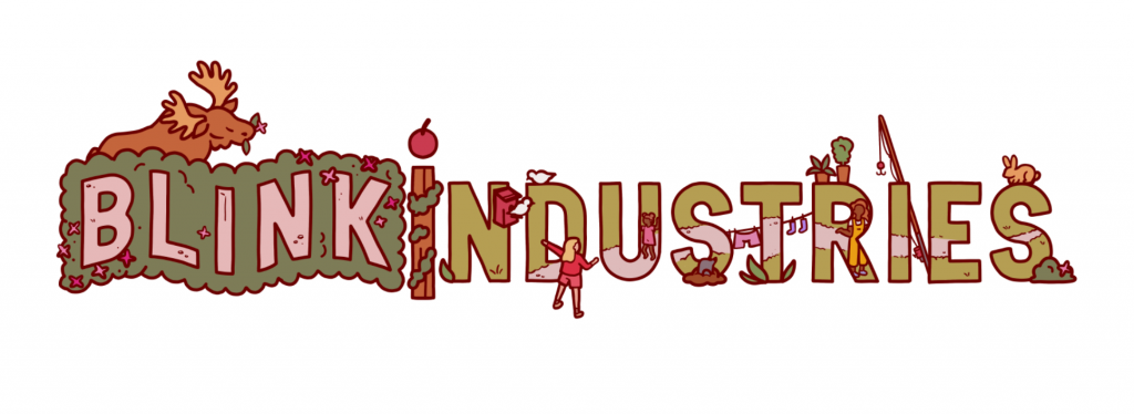
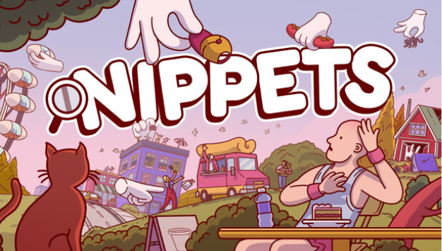
One of my most important, and most challenging live briefs that I completed during my DPS year was with Blink Industries. Our job was to design an animated logo in the style of their newly released game, Nippets – a 2D hidden object game inspired by the joy of people watching! In teams of 2-4, we redesigned the Blink Industries logo to resemble one of the four seasons in the game, and then brought it to life through animation. These animations would be shared on social medias as promotional works, with us tagged as collaborators and artists upon the games release.
In this blog entry, I will be covering the entire experience from concept, to our screening at the Blink Industries Studio!
Blink Industries Briefing
To deliver our brief, the Nippets producer Nicola Strina visited LCC. He started by introducing himself with a talk on the current gaming industry, discussing how they’re pivoting into making smaller games with much tighter development times, scope and budget. He discussed the importance of a quick validation cycle, and how it’s important to build a community excited for release. Such strategies can be seen in games like Peak, Buckshot roulette, and a game about digging a hole. These strategies are how they made Nippets!
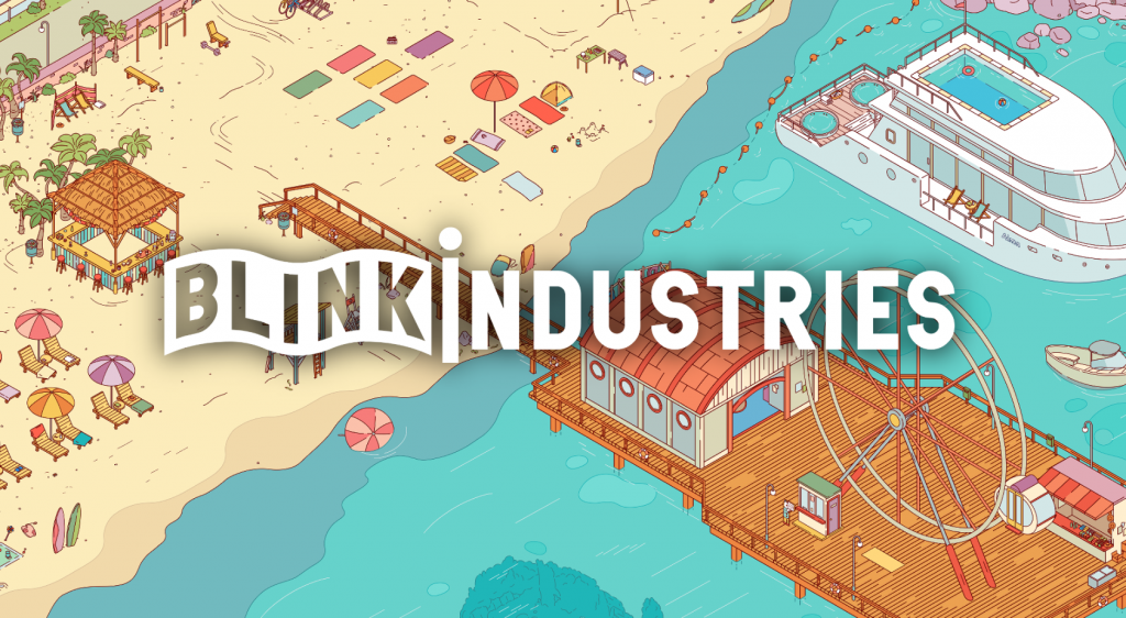
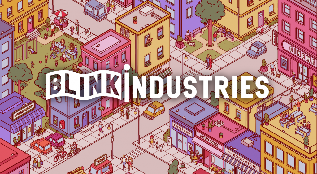
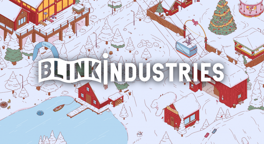
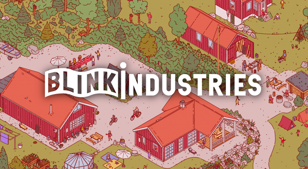
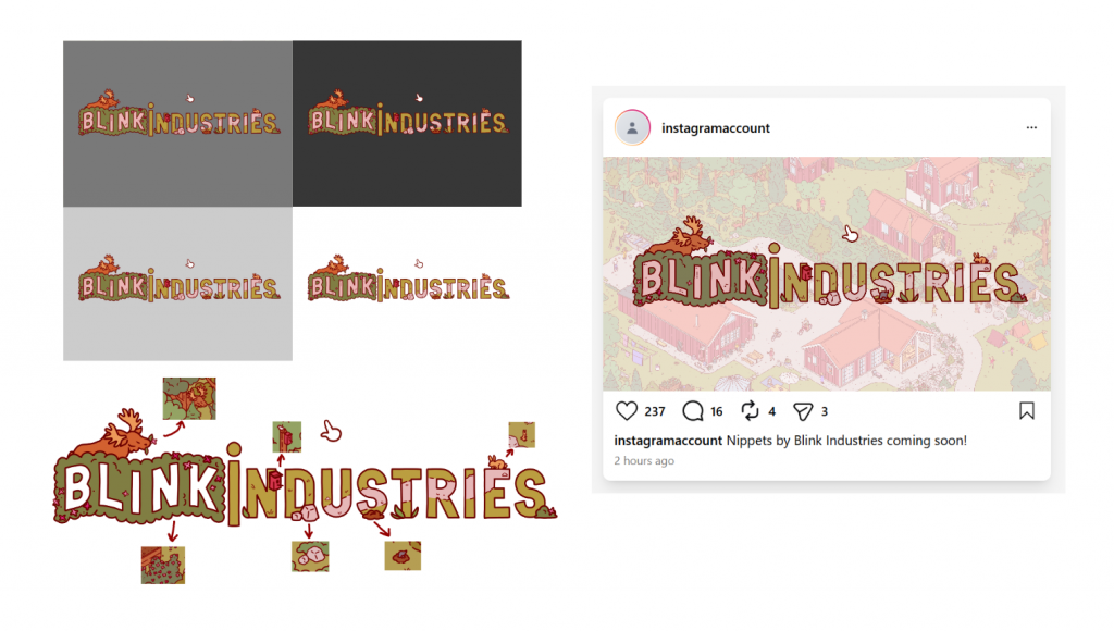
We were then introduced to our brief In full, to redesign the Blink Industries logo (shown above) in the Nippets seasonal styles (backgrounds shown below). This logo would also be animated, to be posted on social media. Here are some notes from the brief:
- The animation should loop seamlessly
- The animation should have a transparent background (although make sure that it works well with a background)
- Keep the logo recognisable at all times
- Do NOT redesign or turn into a character
- Allowed: subtle motion, environmental effects, seasonal VFX
For inspiration, we could look at the Blink Industries Idents that had been made in collaboration with art students for previous years.
Concept
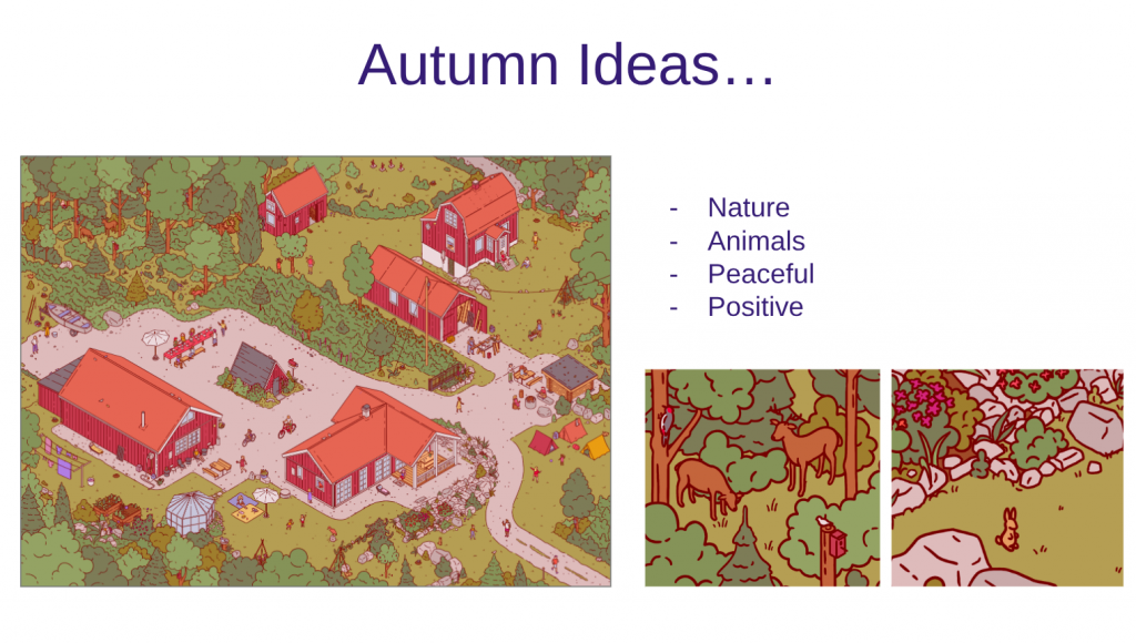
Once the briefing had concluded, I made a team together with my fellow DPS students Amy, Kofi and Pelin. When taking a closer look at the seasons, we decided to settle on Autumn as our theme and began brainstorming all the different ways we could convey the season.
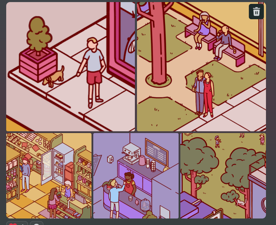
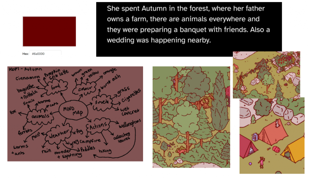
Over the next couple of days, we each played the demo and analysed the visual style which was a combination of frame-by-frame and tweening. We were given the hex code of the line art, and told to keep our lines as accurate and consistent as possible to the game world. We looked closely into our autumn reference image, and picked out aspects of the image that we found interesting. In particular, we wanted to focus on nature and the presence of a wide array of animals! We collected words associated with autumn, and coordinated a pinterest board.
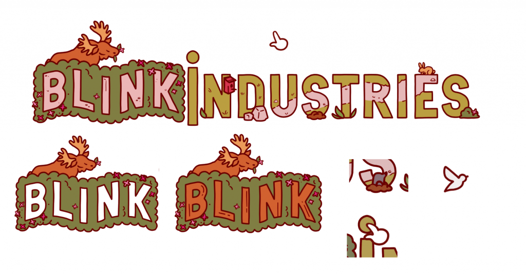
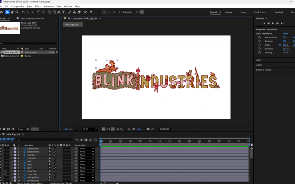
I started the design process by transforming the original Blink logo into something that could be present in Nippets, giving the logo a rounded outline in the colour we were provided with. I sent a transparent, line art only version of this logo to the rest of my team to help us kickstart our design process and get to making iterations. We decided to each come up with our own iterations to start with, as to make as many ideas as possible at this stage and then refine them later. We’d be showing our first set of idea’s to our tutor, Joshua, in a meeting coming up soon.
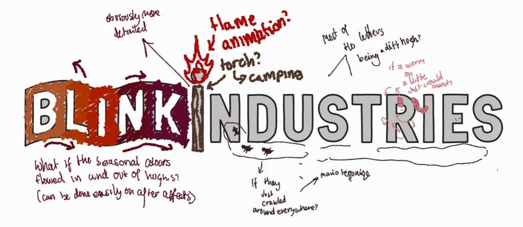
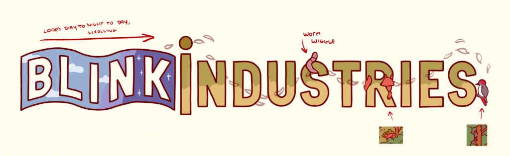
A few of our first ideas involved incorporating a scrolling day to night cycle that loops through the Blink banner, leaves flowing throughout the letters, and animals that interact with and pop out from the lettering. We kept our colour palette very cozy. When we showed these first design ideas to Joshua, he gave us plenty of good critique.
- tie your ideas into Blink Industries identity
- colour pick from the autumn reference image
- Increase saturation and add more visual interest
- choose statement colours
- work on contrast and values, variations in lights and darks
- make certain aspects bigger and others smaller, breaking up the sizing will make each aspect more readable
- consider the actual movement styles, not just what’s happening
- consider different effects and textures
He also gave us advice for our eventual pitch meeting with Nicola.
- Pitch 4-5 separate ideas and be open to conversation
- crop it to aspect ratios, show it on light and dark backgrounds for posting on social media
- be confident, rehearse and take turns
- research blink beforehand so you can accurately apply your ideas to their identity
- keep slides neat, stylised and easy to read
With this advice in mind, we went on to create more concepts!

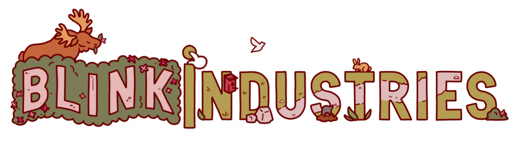
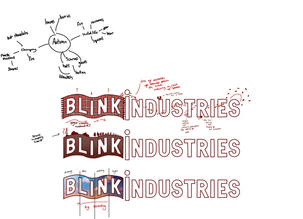
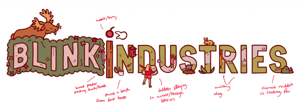
We decided to stick with the main theme of nature, every one of our ideas keeping it at the forefront. For my idea, I wanted to reference the gameplay of Nippets directly by adding a cursor. This cursor would click on parts of the logo, causing different animations to play, much like how the game itself operates. For example, when the bush is clicked a moose will pop up, and a bird will fly out from the bird box. I transformed the Blink banner into a flowering bush, and designed a path that flows through ‘industries’ to change the interior of the letters into a small scene.
Following Joshua’s advice, I made sure to vary the detail and sizing throughout my logo. I kept the colour palette of the logo itself majority green, so that the important animated assets and animals that are brown, red and orange would be able to pop out against that backdrop.
Midway pitch presentation
Happy with our range of ideas, we began organising our presentation.
For our presentation, we created a title slide, a brief research slide and an X slide. We then showcased our work, and added extra slides after each idea to display how our ideas would look on different shades of backgrounds and posted to social media. As pelin had an animated video to share for their bird picking up an apple idea, I uploaded the animation to an unlisted YouTube video to embed in the presentation. I did the same for Kofi and myself. This way I could play the videos seamlessly during our pitch! We each practised what it was we wanted to say, and before we knew it- it was time for us to show our work to Nicola!
Nicola appreciated our work and let us know which aspects from our iteration to follow through with for our final design. He decided that my moose concept was the strongest base, but emphasised that Pelin’s bird animation would be a great addition. For critique, he brought to our attention that our logo designs don’t have any people in them- and Nippets is a game about people watching! It would be a great idea for us to add people, and so Nicola suggested that we add a person passing across the screen through the scenery/path inside the letters. He loved the cursor idea and the link to Nippets gameplay, mentioning that it would be even better if we added more aspects to the design so that each time you watch the loop there’s more to discover.
Refining our Design
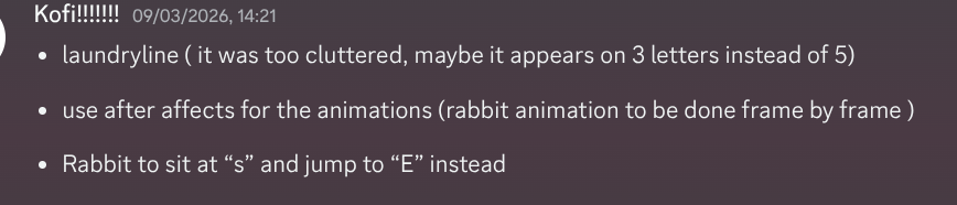
We then had another meeting with Joshua, who gave us several critiques:
Our next step was honing our design following the guidance of Nicola and Joshua. We focused on adding people and extra detail, carefully considering how everything would move.
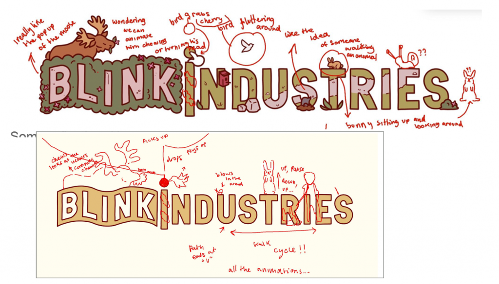
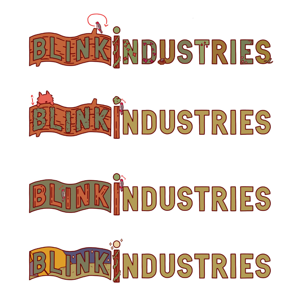
Amy placed people inside the letters, children passing a ball between each other inside the letter and back out again. Kofi conceptualised the overall movement, Imagining how the bunny rabbit would move from letter to letter. Pelin organised extra props and detail, filling out the scene with the addition of plants, washing and a fishing rod that would all sway gently in the animated breeze. I then combined each aspect into one image! At this point our logo felt far more developed, but the amount of detail felt overwhelming. Thankfully it was time for another round of critique.
I began making adjustments immediately- shrinking and redrawing the washing line so it was less cluttered and removing some unnecessary props. I changed the rabbits positioning, and made sure the lines of the path were now defined and clear.
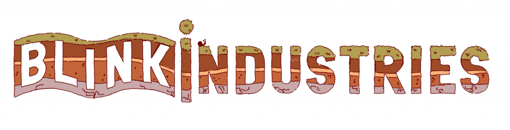
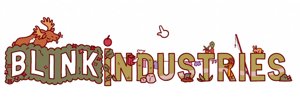
Final Logo Design:
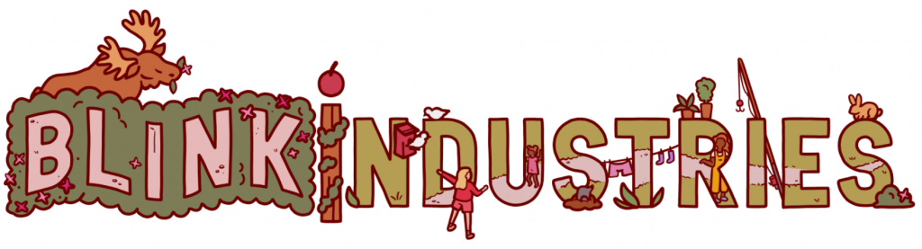
At long last the logo we would be animating was complete! At this stage I was very proud of our progress so far, loving our design. I was also very intimidated… it was going to be my first time animating on this scale, and my first time ever using after effects.
Animation
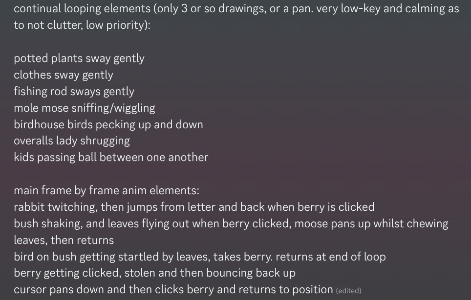
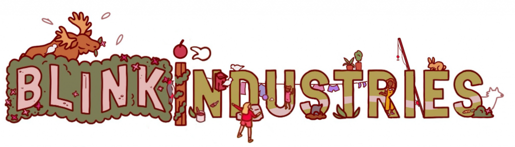
We began organising how our animation would look, how each aspect would move and who would be animating them. Pelin focused on their bird animation, refining it and using the new design where the I of Industries has been transformed into a berry. Kofi was working on the rabbit, doing the frame by frame animation of it hopping back and forth between the letters. Amy was animating the children passing the ball backwards and forwards.
My job was to animate the cursor clicking the I, and the moose rising out from behind Blink, chewing on the leaves of the bush before disappearing once again. I was also the compositor, in charge of putting each individual animation together into one file. I also animated the smaller details, the plants clothes and fishing rod swaying in the wind. The birds pecking up and down, and the mole popping in and out of the earth was also up to me. For this, I would be using mostly pan animation and tweening as to not overwhelm the viewer, the bird and rabbit would be our main frame by frame aspects.
Despite being the compositor, I had never used After Effects before and would be learning how to use it entirely on the job. I watched a ton of Youtube videos on the process, starting with exporting our combined logo design over from Photoshop whilst preserving all the individual layers. To add the animations of my teammates, I learnt how to use colour keys to remove backgrounds.
For my moose animation, I used squash and stretch to exaggerate the moose retreating back behind the bush. I also added leaf particle effects that fly outwards when they raise, playing with the spacing of key frames and the level of opacity to make them fade away.
It was incredibly challenging putting everything together and bringing the png sequence of the rabbit into the file as the animation was very small with pixellated line art over a background that wasn’t yet transparent. After adjusting the settings of the colour key I was able to get a satisfactory result, ready to show Joshua for more critique.
You can see the first version of our animated logo in this video:
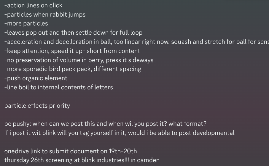
Joshua’s main critique was to add more particle effects. Instead of the leaves disappearing, they could settle at the bottom of the bush and last for the full animation loop. When the rabbit jumps, particles should raise from the letters showing the impact of the landing, and the paws scuffing up the grass/earth. When the cursor clicks, there should be particles as well to emphasise what otherwise is a pretty subtle movement. We were also given tips on how to make the animations more natural, one way being to make the bird pecking less rhythmic as birds pecking in real life is a lot more sporadic and fast. The berry should hold its volume when it squishes, instead of collapsing completely. The ball being thrown currently feels weightless, so it should be animated with a lot more speed and weight/impact when it lands in the characters hands.
We were now in the final stretch. It was time to use these last pieces of critique to elevate our Logo to our best ability and finalise it. We made sure to check if it stood out against our Autumn background, and thankfully it did!
Final Animation and Screening
Here is our final logo animation, looped for a minute:
I am incredibly proud of myself, my team and our end result. When starting DPS, I never thought i’d be picking up an animation/editing software like this and making something so polished in it. I’ve never done logo design before either, and so having such a strong first attempt is very exciting.
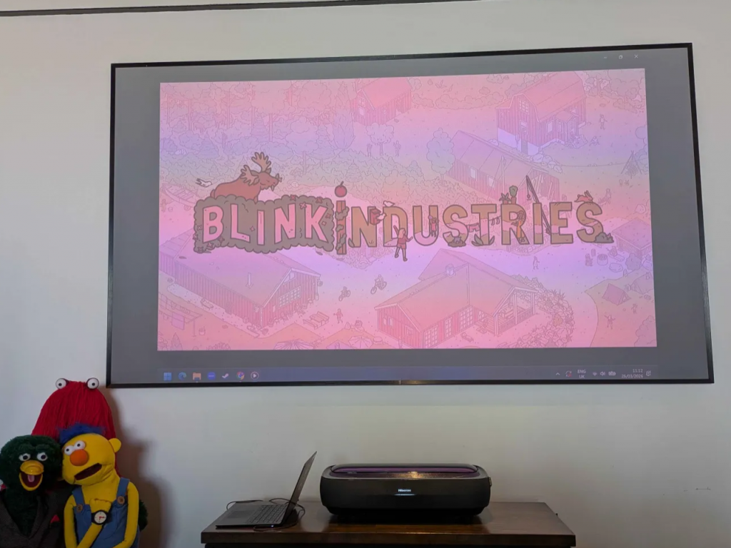
Now our animation was finished and uploaded to Onedrive, it would be screened at the Blink Industries Studios where we’d be getting a tour!
Leave a Reply