Introduction
For this live brief, I was given the task of creating a graffiti-esque mural to populate the streets of a video game. This game takes place in the setting of Brick Lane and features the 17 UN sustainability goals. In this blog entry I will be going through my process, from research to execution!
Research
Before putting pen to paper, I wanted to make sure to do thorough research on my sustainability goal and what it represents. I visited the United Nations sustainable development goals website and learnt all that I could gather before making moodboards and ideas for my presentation.
Put simply, the goals main objectives are:
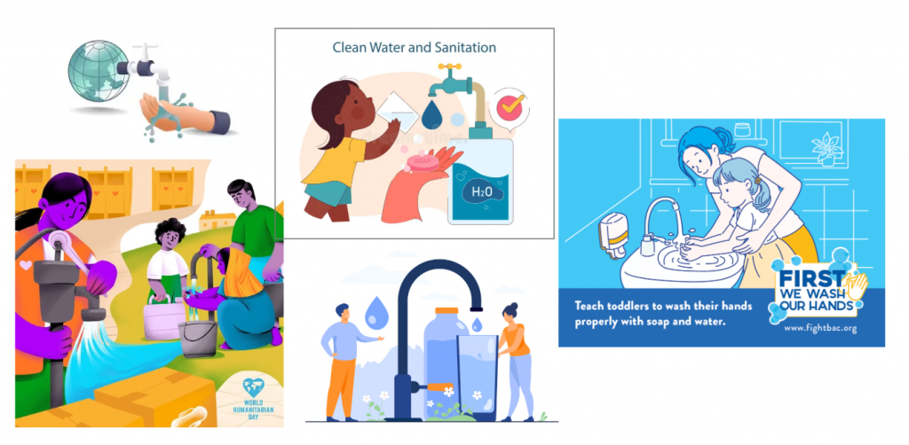
- Drinking water safe and affordable for all
- Access to sanitation and hygiene
- Protect water-related ecosystems
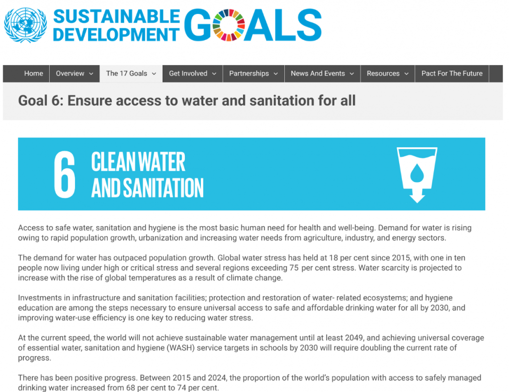
It is important that my mural presents each of these goals clearly. When looking through the iconography and graphic design present on the website, the colour associated with goal 6 is a bright cyan. When it comes to symbols and objects, taps, glasses of water, sinks, and soap. There are also mountains, rivers and trees present around text discussing water-based ecosystems. I decided that the best way to bring across a similar message would be by taking these design aspects and incorporating them into my own work and style.
Mood Boards and Style Analysis
To begin conceptualising how my mural would look, I began gathering various references. My mood board consists of atmosphere and colour palette references, relevant video game graffiti references, as well as info graphics based on clean water and hygiene.
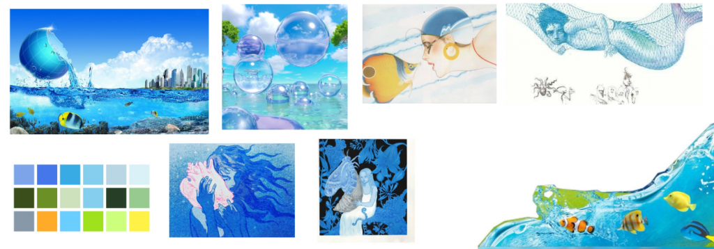
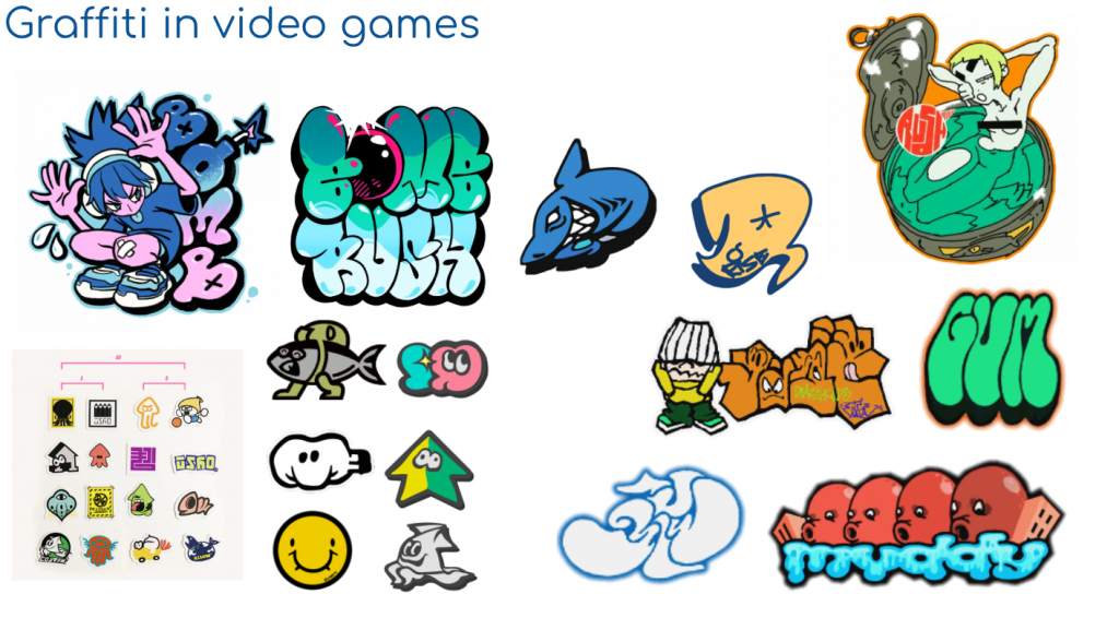
For my piece, I wanted to combine both the expressive and bold video game graffiti style with the more informational and straightforward info graphic style. It was a challenge to find a middle ground between visual excitement, and the messaging I wanted to convey. In the video game series Splatoon, the iconography and art style takes inspiration from many types of sea creatures, aquatic wildlife and water imagery- easy to apply to clean water and sanitation. I plan on adding a sea/water creature to my piece in a similar style.
In the graffiti artwork, line work is bold and harsh with exaggerated sweeping shapes to mimic the movement of spray painting. Info graphic style however is simple and reserved, round to appear inoffensive, and often removes line art all together. To try and capture the essence of both styles, I aimed to create a piece that is round, visually appealing, with large bold shapes, but a colour palette that is gentler and softer to the viewer. Evoking calm water, health, cleanliness- but also the fun movement and excitement of graffiti artwork.
Concept
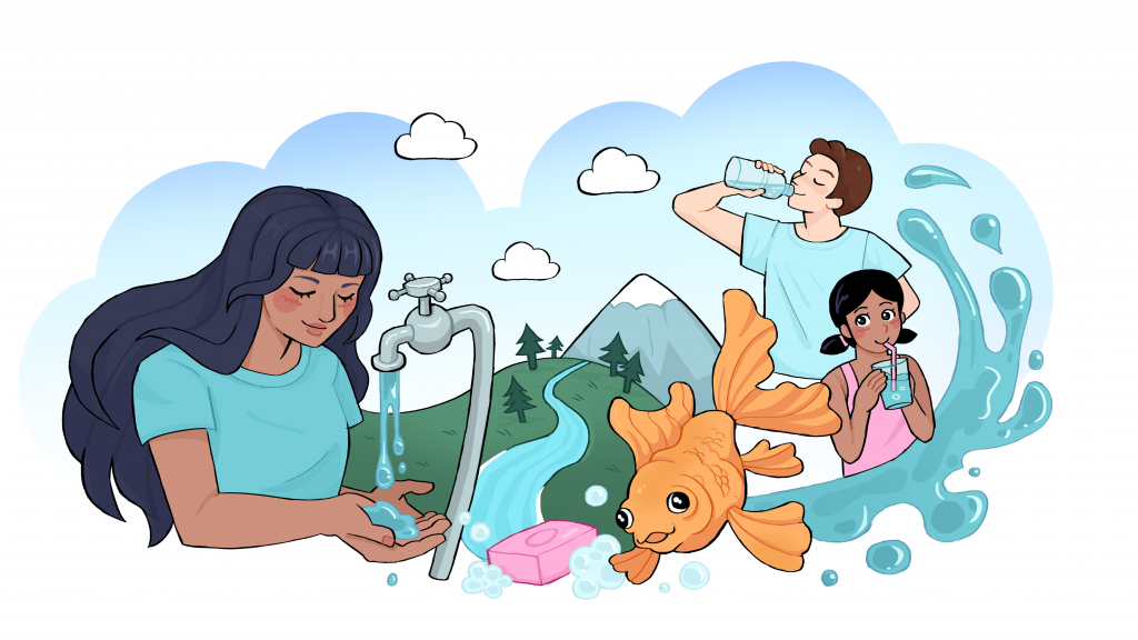
Once I had my inspirations, research, mood boards, and general idea, I was ready to make some initial concept sketches. I wanted at least one subject to portray each core objective of the sustainability goal. One for available clean drinking water, engaging with water from taps or bottled water and drinking it, one for hygiene, perhaps taking a bath or washing themselves, and one representing water-based ecosystems, wildlife, and the cycle of water in nature.
The scene should stress the importance of water: how crucial it is to everyday life, health and hygiene. The figures in my illustration should look happy, calm and content. I want to evoke a peaceful atmosphere. In the background I wish to include the entire water-related ecosystem, such as mountains, forests or lakes with clouds overhead. For the colour, I want to use the aforementioned cyan: clean, crisp and calming.
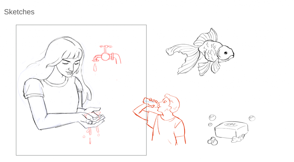
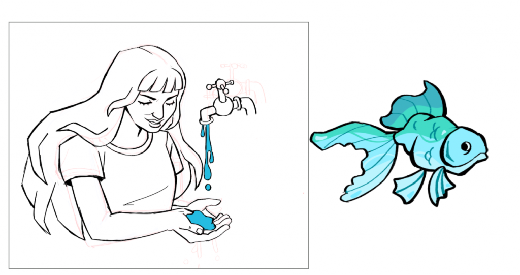
I made some initial sketches of a goldfish and man drinking water, however when trying to add these sketches into an overall composition- they appeared far too stiff. If my mural wanted to look convincing and dynamic, I would have to redraw them to fit the flow of a scene. Upon redrawing them, I made sure to make their poses less 2D, using foreshortening to have the goldfish look as though it is swimming out towards the viewer as a splash of water trails behind. The head of the man is now also angled towards the viewer, as to show his expression clearer and make it easier to engage with. I also simplified my figures, keeping their features incredibly simple as both street style art and informational art tend to stylise faces for easy readability and appeal.
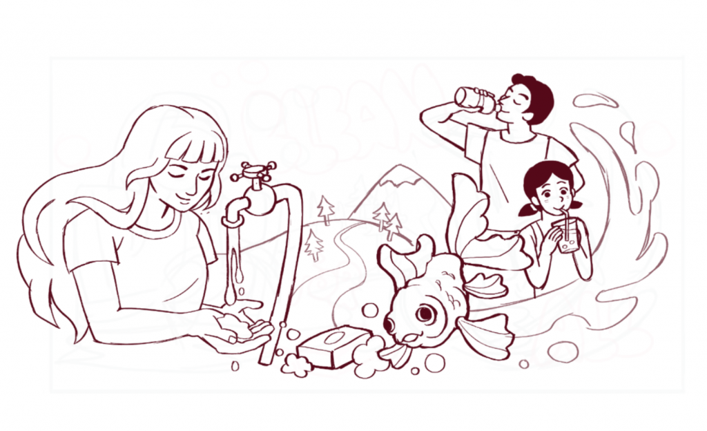
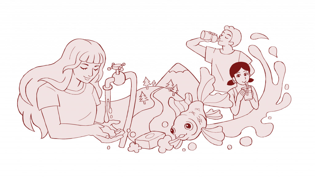
Execution and Final Piece
I presented my mural in 3 layers. A basic line art layer, a flat colour layer, and a final layer. This is because in the game, each layer is painted by the player character one after the other with spray paint as a slow reveal.
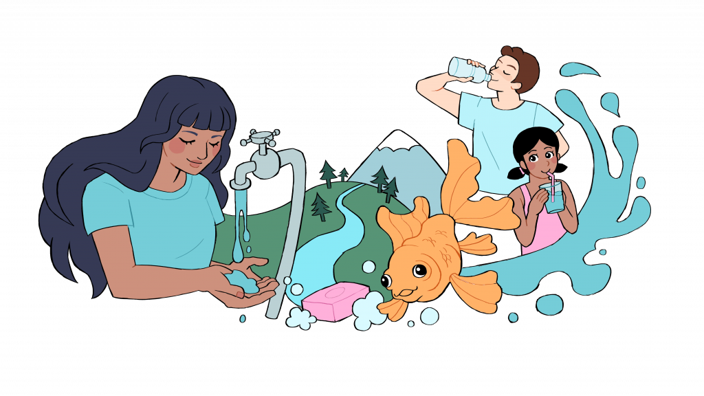
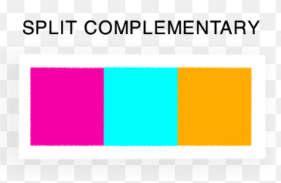
For the colour, I really wanted to emphasise the cyan with a split complementary colour scheme, emphasising the blues without straining the eyes.
To make sure that the mural is readable when painted against the walls in the game, I added a bubble / cloud shaped silhouette with a subtle gradient behind my illustrations to give the impression of a blue sky overhead.
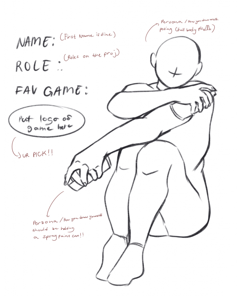
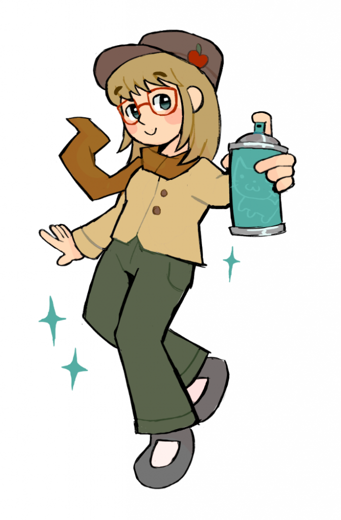
Promotional Artwork
Outside of the mural, I took part in the promotional artwork that would be posted on social media to promote the game. Each artist was required to draw themselves holding a can of spray paint, calling back to the game’s main mechanic, as well as list their roles and interests. My self portrait doodle can be seen on the right 🙂
Leave a Reply